New Features
With Release 52.0, we are introducing several enhancements to our process page, primarily:
- Enhanced process navigation
- Filter and search of the the four categories of data within your process
- Ability to resize the process navigation panel to your desired width
- Status beacons for stages and tasks
- Tasks redesign
- Fully featured charting is now embedded in the process page
Process Header
Starting from the top of the process page, you can see that the tabs that were visible in the row under the process name are now behind the “3 dots” icon in a single row of navigation on the top right of the screen. You are defaulted to what was the ”details” tab while the other options, that are used less frequently, are accessible by clicking the “3 dots” icon. This makes the process page cleaner and gives you more vertical space to see data on the page.
Please see the Before and After images below.
Before

After

The options for Changing the Priority, putting a process on Hold or Voiding a process are available when you click the process icon with slight design changes. The status of the process is now visible under the process name at all times.
Before

After

Third, the option for split screen is now located next to the “3 dots” icon. To turn off the split screen you can press on the icon again and the screen will revert back to non-split or full size of the left pane.

Navigating Data in a Process
Now process navigation is clearer, and you no longer need to expand and collapse stages to find your records. All tasks and records are listed in the process navigation panel, under each stage. All invalid records are still clearly marked red.
The categorization of data types (we are calling them “resources”) in the process navigation panel of the process page now represents the main way of reaching a desired record, task, compare table or view in a process. Instead of scrolling in the main working area panel on the right, users can click on any resource in the process navigation panel on the left and see the desired data in detail on the right. This, coupled with being able to filter and search these categorized data resources in a process, makes navigating processes with 100’s of data resources easier and faster.
Data Resource Types in a Process
In the process navigation panel, you have access to four types of data resources in a process:
- Stage Records
- Tasks
- Compare Tables
- Views
Each of these resources has a dedicated icon and color that is representative of the type of resource and does not represent the status in which the resource is.
The status is available under the name of the resource. See an example below:

Here are the four different resource icons:
1. Stage Record

2. Task

3.Compare Table

4. View

Figure 5) Icons for Four Types of Data Resources in a Process
Process Navigation Search
At the top of the process navigation panel, there is a search bar. You can either filter by stage record, task, compare table, view name or status. Or you can also search on the words in the titles of the four types of process resources.
In the example below in the bar, we typed in 'task' to see all the tasks in that process:

Process Navigation Panel Width Resizing
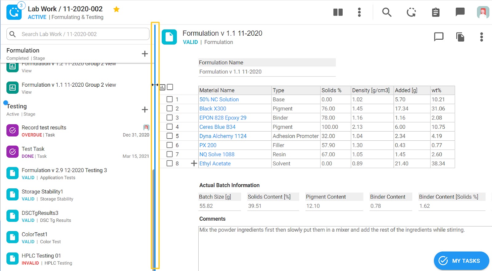
The width of the process navigation panel can be easily resized by dragging its right border left or right to fit your needs. As the navigation panel narrows, there will be more width in the right main "working area." This is particularly helpful if you have longer resource names in the process navigation panel and you want to see more of the text or if you have wide data tables or views and you want to have more space in the main working area.
Required Actions Indicated With Beacons
When you enter a certain process, whether that be from your assignments or a view, you will be immediately taken to the active stage of that process.
Now, you may notice pulsating blue beacons next to the stage and/or task name. The beacons denote important information about the stage or task.


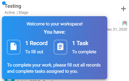
When you hover over the beacon next to the stage name you will get information about how many tasks need to be completed and how many records need to be filled out on that stage. See the example below:
The beacon next to the Task is visible when all records on that stage are valid. This is because all records need to be filled out first and then this beacon is guiding the user to go to the task and complete it.
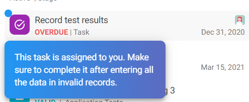
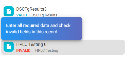
”Helper” text is also available if you hover over an invalid record. There is no beacon dot, but the helper text will show up nonetheless.
Tasks Redesign
With this release the tasks have slightly changed to make it easier for our users to access and manipulate task information.
Task Overview
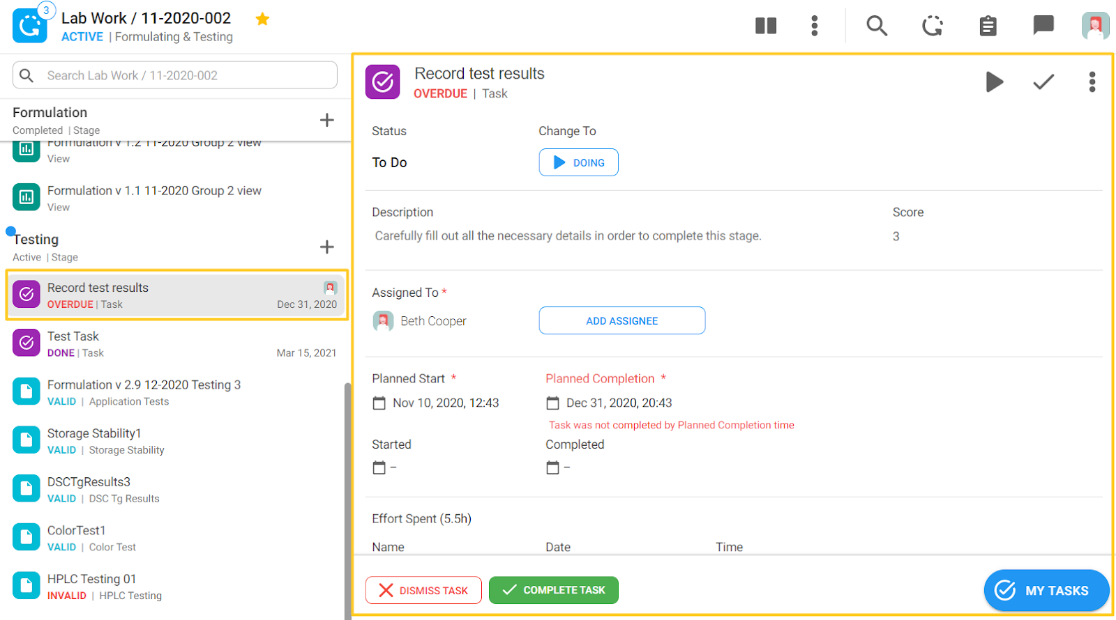
All tasks now have a purple icon with a check. When you click on a task in the left navigation, full task data is shown on the right main working panel as seen in the screenshot below. Previously the task panel was showing up in a middle panel on the page, but now it occupies the whole main pane.
Before
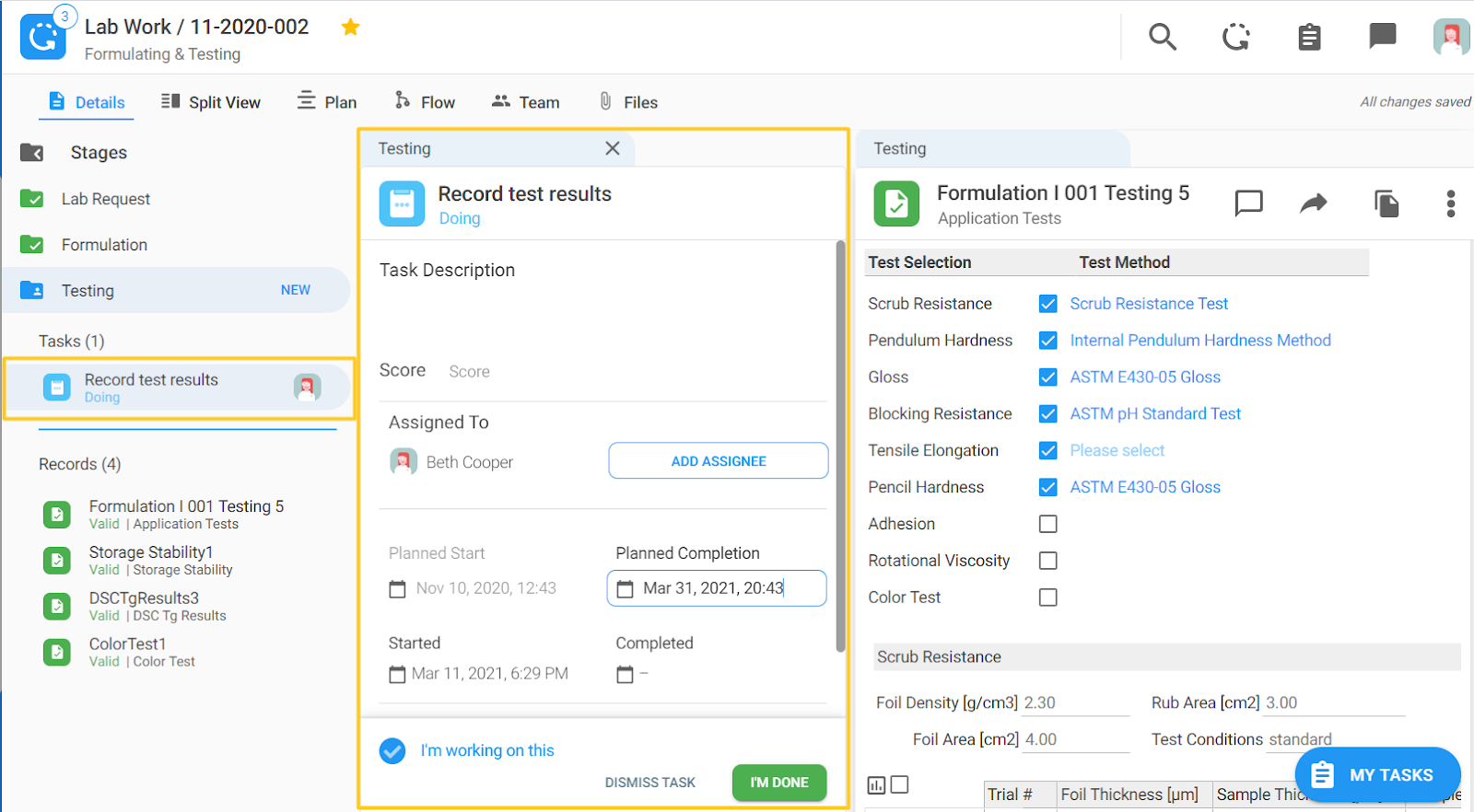
After
Task Elements
If you look closely, all the elements from the task are still visible, just in the main pane.

Let's take a look at each section.
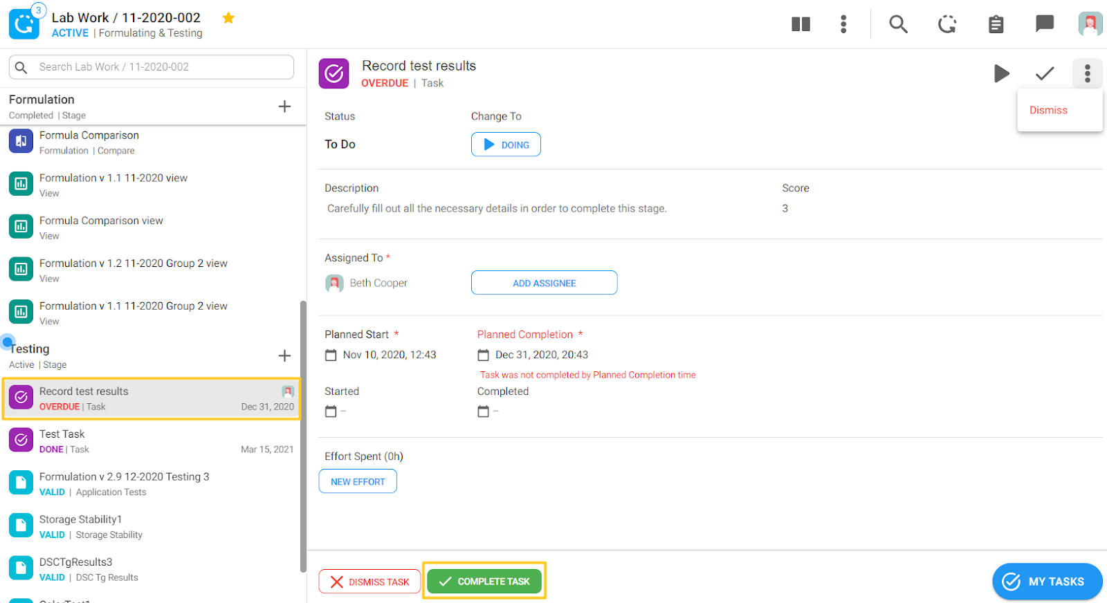
At the top of the task view you can see the task name, below it you can see the current task state - in the image below it's overdue and in red. The status of the task below is “To Do” and next to it is the button for changing the status - by clicking on the “Doing” button the task status will change. On the far right, the controls are as follows:
- Play icon - to start doing the task
- Check icon - to complete the task
- Behind the “3 dots”icon - to dismiss a task

Task assignment has stayed the same. You click the “ADD ASSIGNEE” button and select the colleague(s) to be assigned to the task.
The dates section has also remained the same.
The Effort button has changed slightly - you can click on the “NEW EFFORT” button to record your effort. When you hover over the effort on the right side you can see the trash can icon if you want to delete it. Please note, you can now add multiple rows of effort hours.

In instances where effort is required to be logged in a stage (you can't proceed to the next stage until you've entered the spent effort), a dark blue horizontal bar will appear in the effort section.
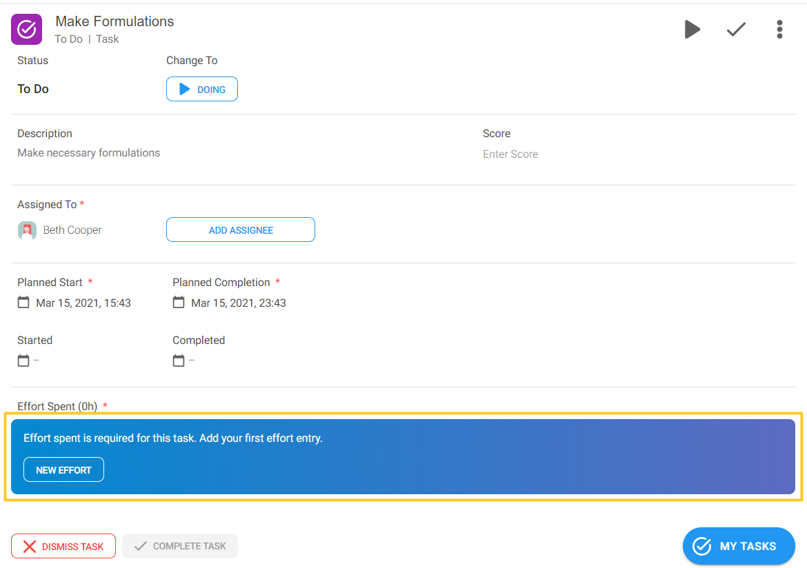
At the bottom you also have the buttons to “DISMISS TASK” and “COMPLETE TASK.” On the Far right side, the “MY TASKS” button remains the same.

Complete a Task
There are 2 ways of completing a task:
1. Clicking on the task in the process navigation panel or clicking on the “COMPLETE TASK” button at the bottom:
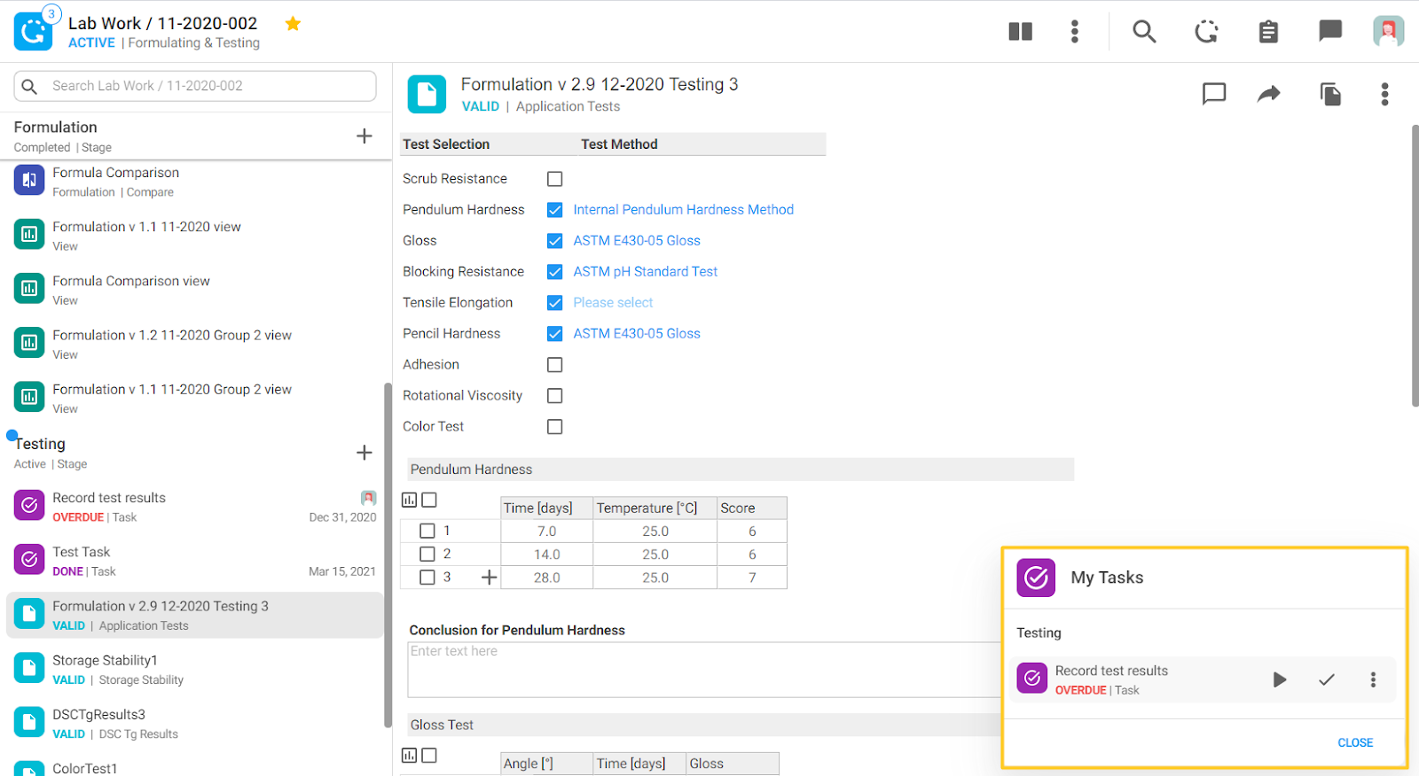
2. If a task is assigned to you, you will have a “MY TASKS” button on the right side. You can click on it and then hover over the task to access task controls. These controls are the same as in the task top header (Figure 13). You can click on the play icon to mark the task as “Doing" or on the check icon to complete the task.
Record Options
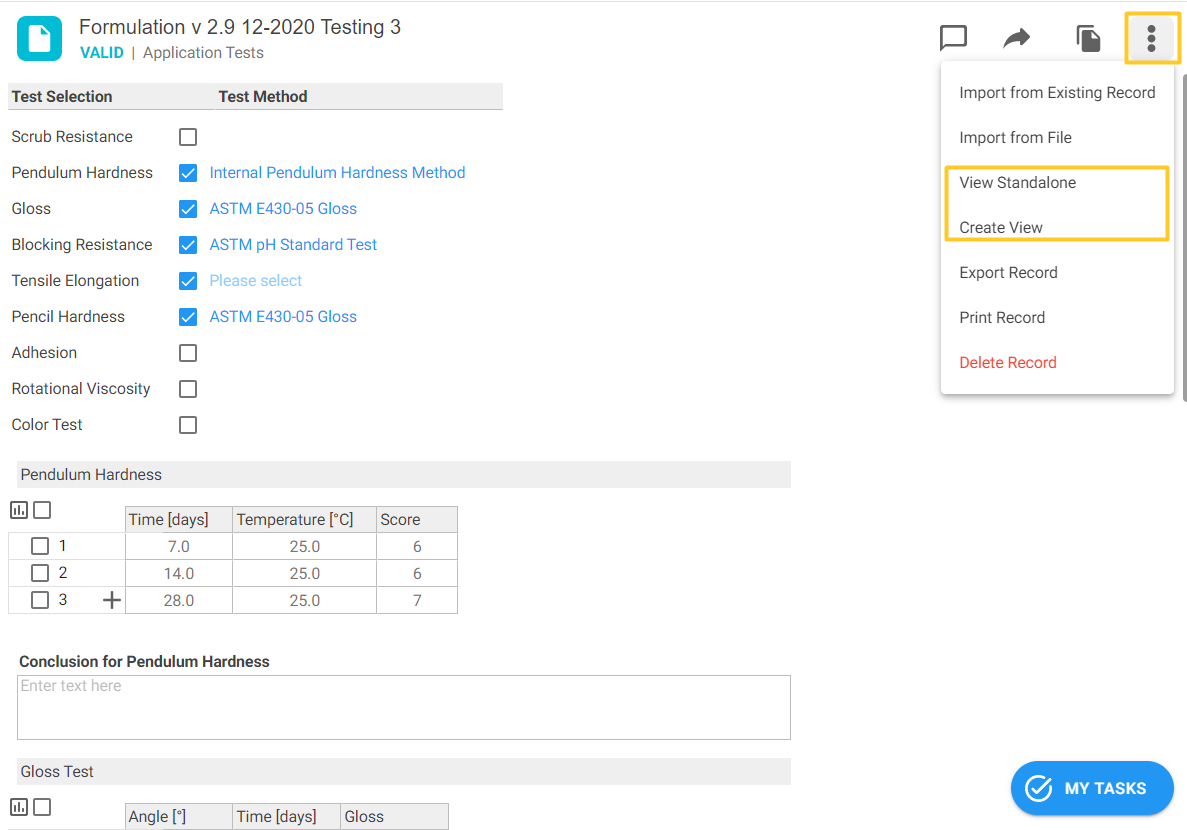
We added some new options behind the “3 dots” icon on a Record:
- View Standalone - this allows users to view the record on a standalone basis i.e., filling the main working pane
- Create View - this is a new option for creating views in records that will be explained in the next chapter
The rest of the options have stayed the same.
Views in Process
With this release the view functionality has been integrated into the process itself. Users can create views with different visualization options:
- Grid
- Board
- Scatter
- Bar Chart
Create a View in a Stage Record
To create a view in a process from a stage record follow these steps:
- Click the desired stage record for which you would like to create a view
- Click on the “3 dots” icon
- Select “Create View”
- Add the other records whose data you would like to include in the view
- If you would like to visualize the data, choose the chart type

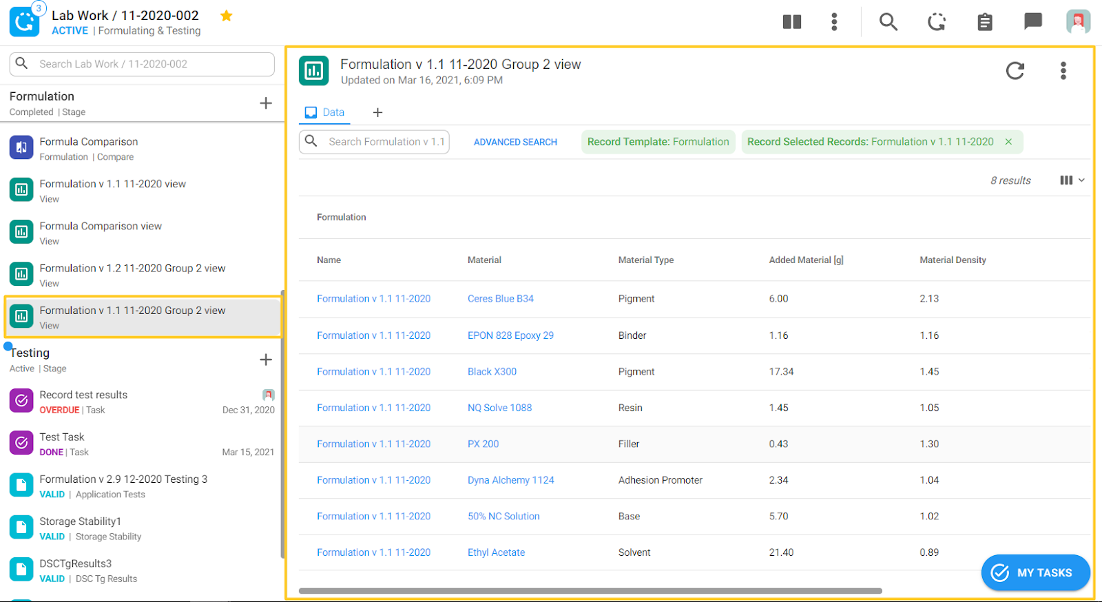
In the process navigation on the left side a new element will appear that represents your newly created view. It has a green icon and when you click on it, you will get the starting point for further manipulating the view. All the features and functionalities of this view are the same as views available in the blue left nav bar menu items.
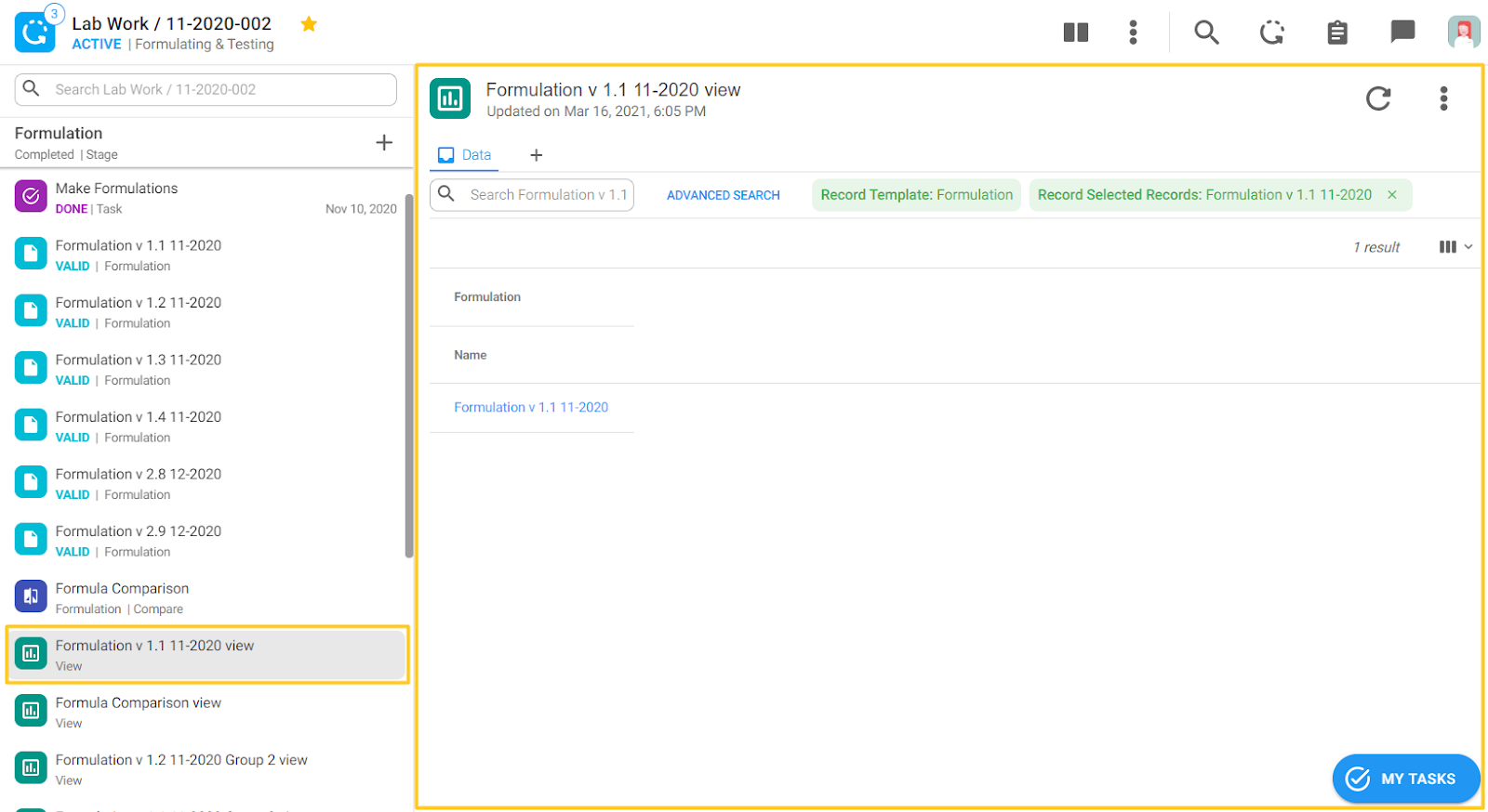
The created view has 2 chips at the top selected as default:
Record Template: Formulation - this means that the starting information is coming from a “Formulation” record template
Selected Records: Formulation v1.1 11-2020 - this is the exact record from which we created the view, in our case Formulation v1.1 11-2020.
By clicking on the “ADVANCED SEARCH” button, other records can be selected. After you select the desired records click the “APPLY” button.

By clicking the column icon on the far right, additional columns can be added.
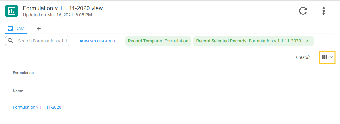
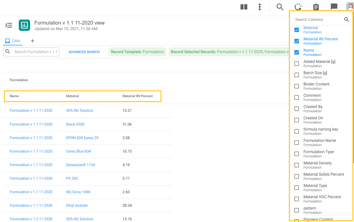
Click on the “+” icon next to the “Data” tab, to access all 4 visualization types.

Create a View from a Table
Next to the table in a record in the record below (in this case a formulation table) you can see a small chart icon that previously said “Show Data as Chart.” Now this icon says “Create view” using the content of a table as the data source as shown in Before and After shots below.
Before

After
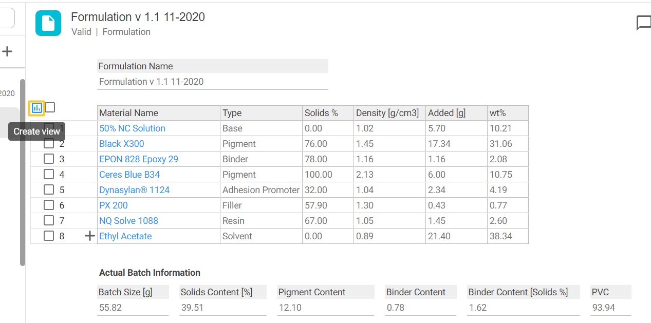
When you click on the icon “Create view” next to the table a new view resource will also appear in the process navigation on the left. The data source for this view will be exactly the same as the table from which the “Create view” icon was clicked. The default chips will also be the same as the table from which the “Create view” icon was clicked.
Create a View from a Compare Table
A view can also be created from a compare table too:
- Go to the desired compare table
- Click on the “3 dots” icon
- Select “Create View”
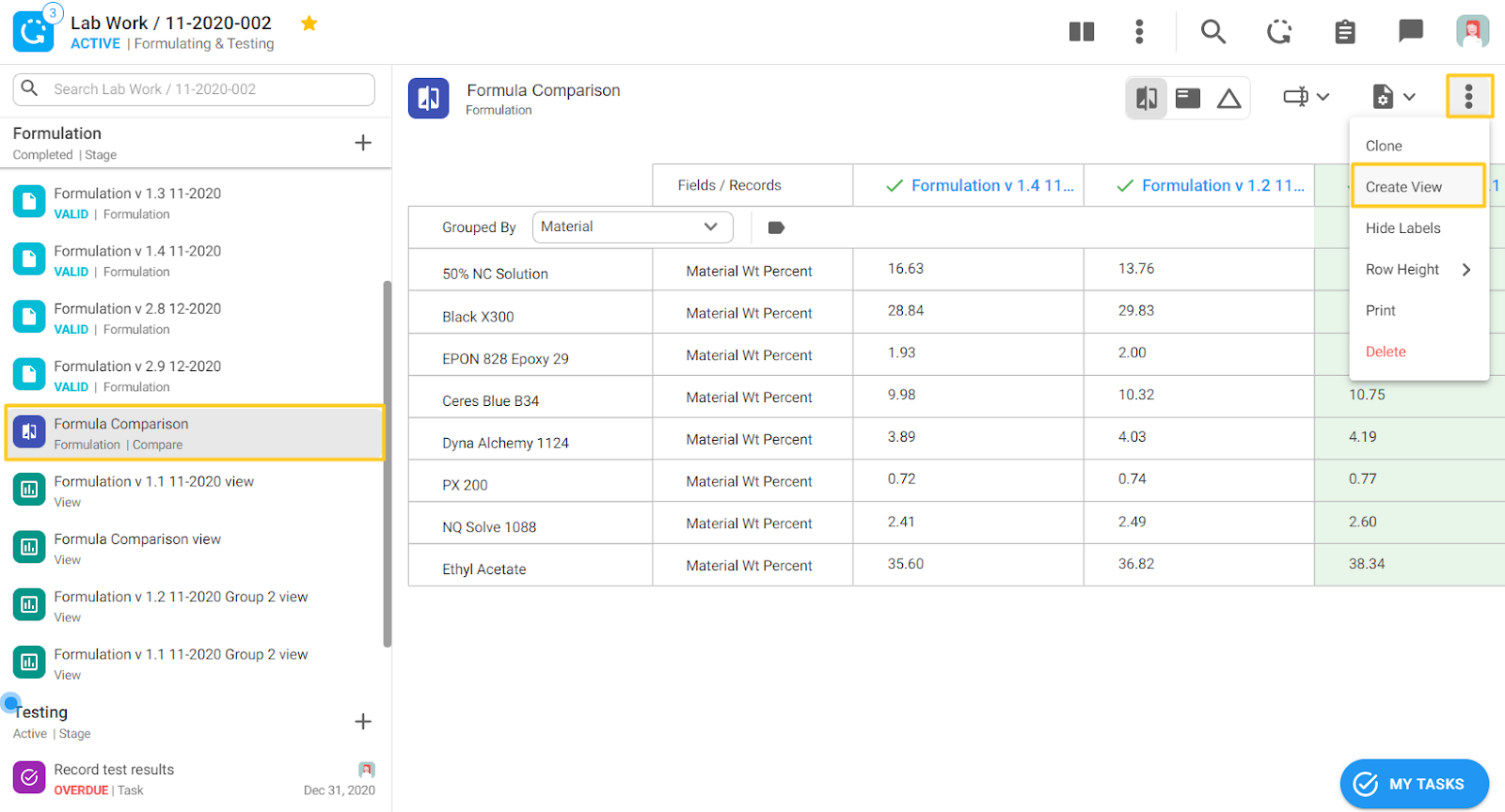
Once you have created the view from a compare table, a new data resource will appear in the process navigation on the left side with a green view icon. When you click on it, you will get the starting point for further manipulating the view if you would like.
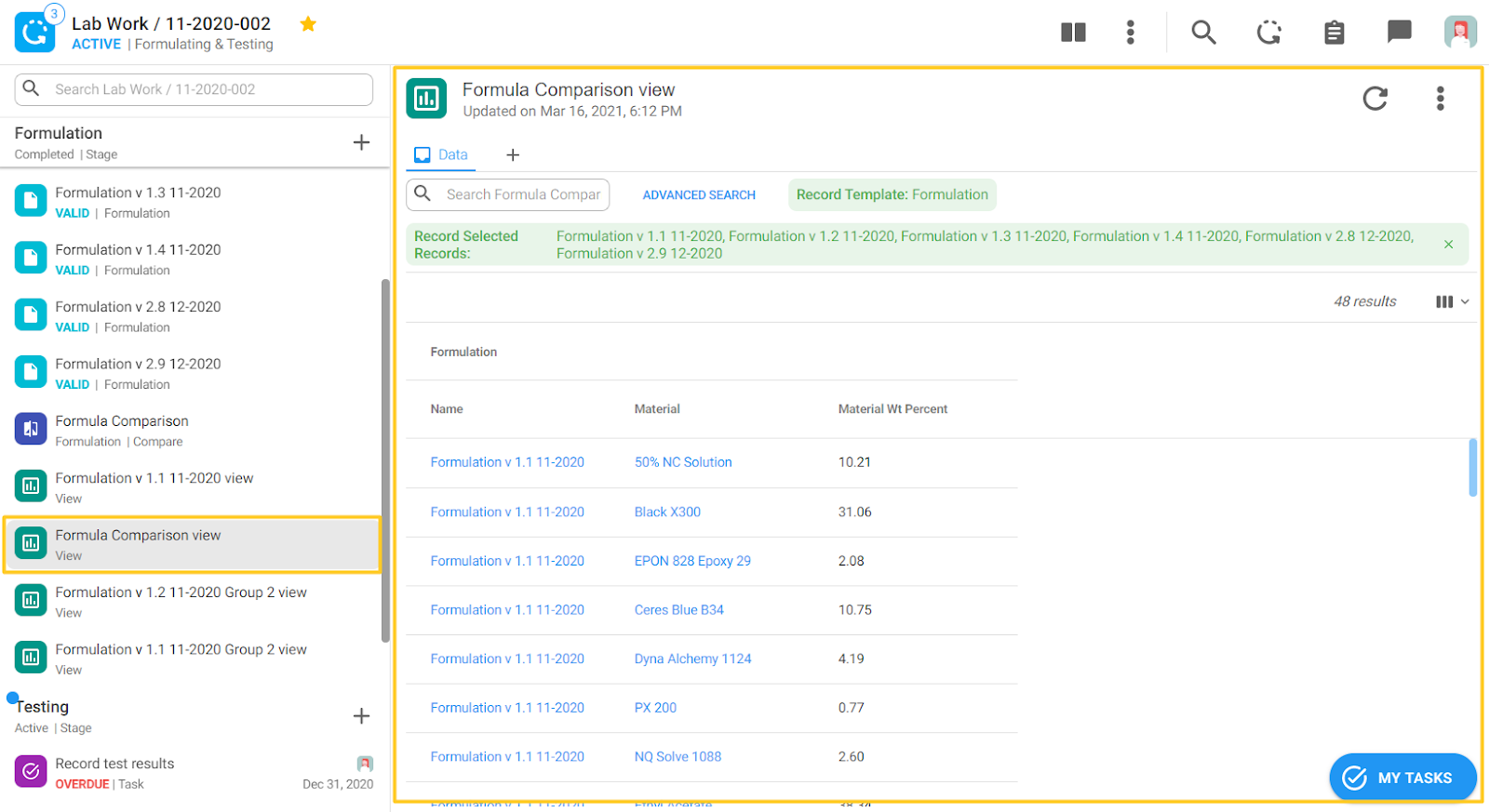
The created view has 2 chips at the top selected as default:
Record Template: Formulation - this means that the starting information is coming from a “Formulation” record template called
Selected Records: All records that were selected in the compare table are also selected by default for the view
The rest of the options are the same as explained in the previous chapter.
New Option - Bar Chart
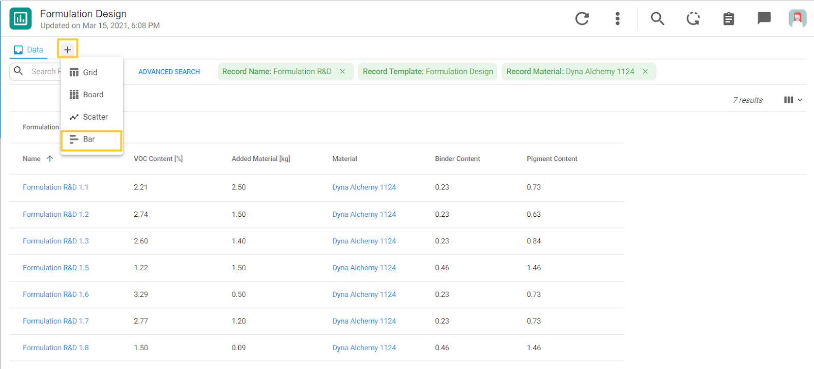
With this release a new visualization option, bar chart, is now available. In the example below, we have a list of formulations and information about their:
- VOC Content [%]
- Added [kg] of the fictional material, Dyna Alchemy 1124
- Binder Content
- Pigment Content
Using this information we can make different bar charts to visually represent data and make it easier for analyzing. To create a bar chart in any view, click on the “+” icon and select “Bar.”
The next screen is the starting point for creating a bar chart. On the right side you can select what will be on the X and Y axes.
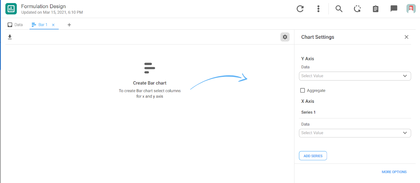
Below we selected “Formulation Name” to be on the Y-axis and VOC [%] to be on the X-axis.

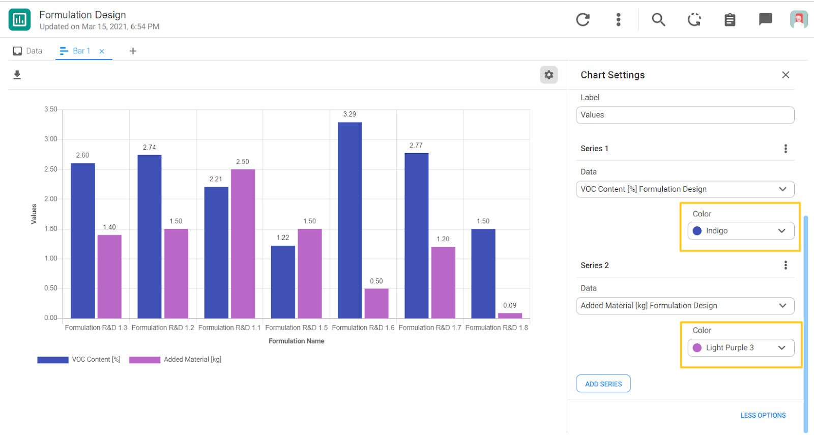
The desired objective of the bar chart is to see the correlation between the added amount of the material, Dyna Alchemy 1124, and the VOC [%] content of the formulations. So we can add another series by clicking on the “ADD SERIES” button and selecting Added Material [kg].
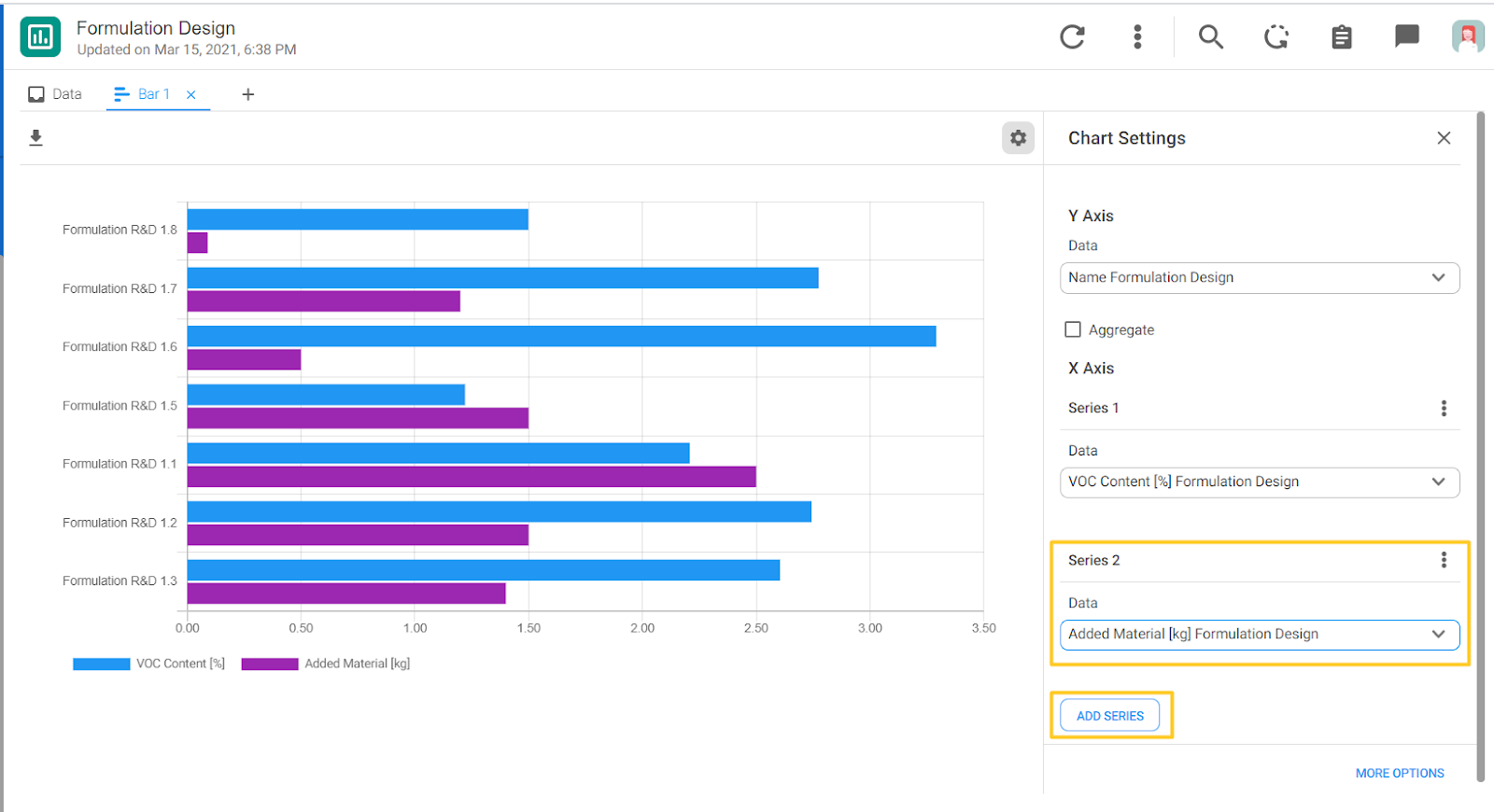
More formatting options are available by clicking on the “MORE OPTIONS” button in the Chart Settings panel.
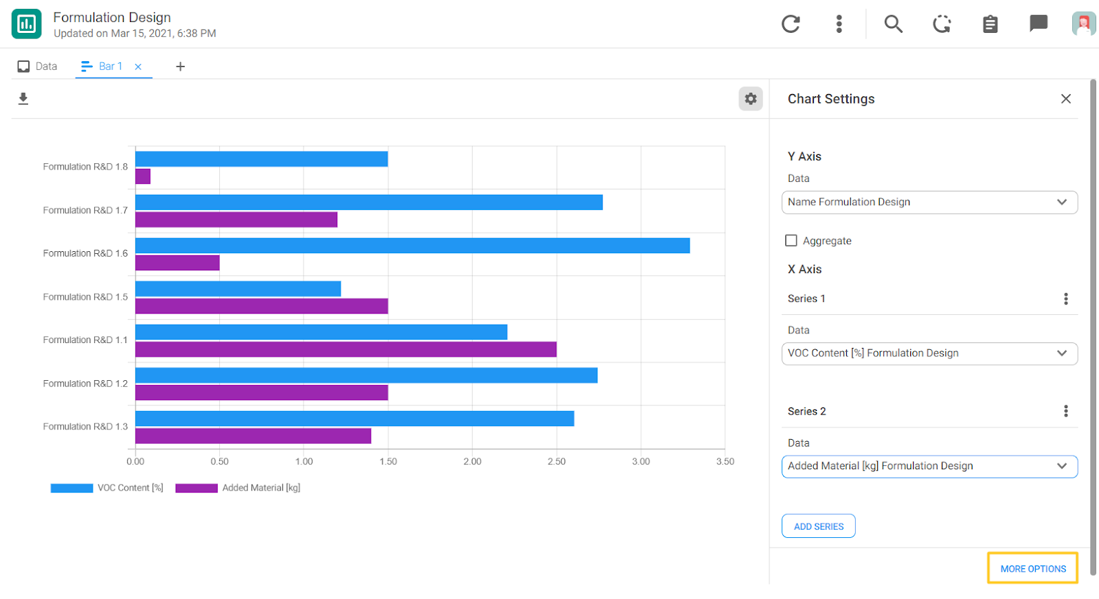
The available options are:
- The Orientation of the bars - could be Vertical or Horizontal
- The Stacking - None, Standard, 100%
- To display bar values
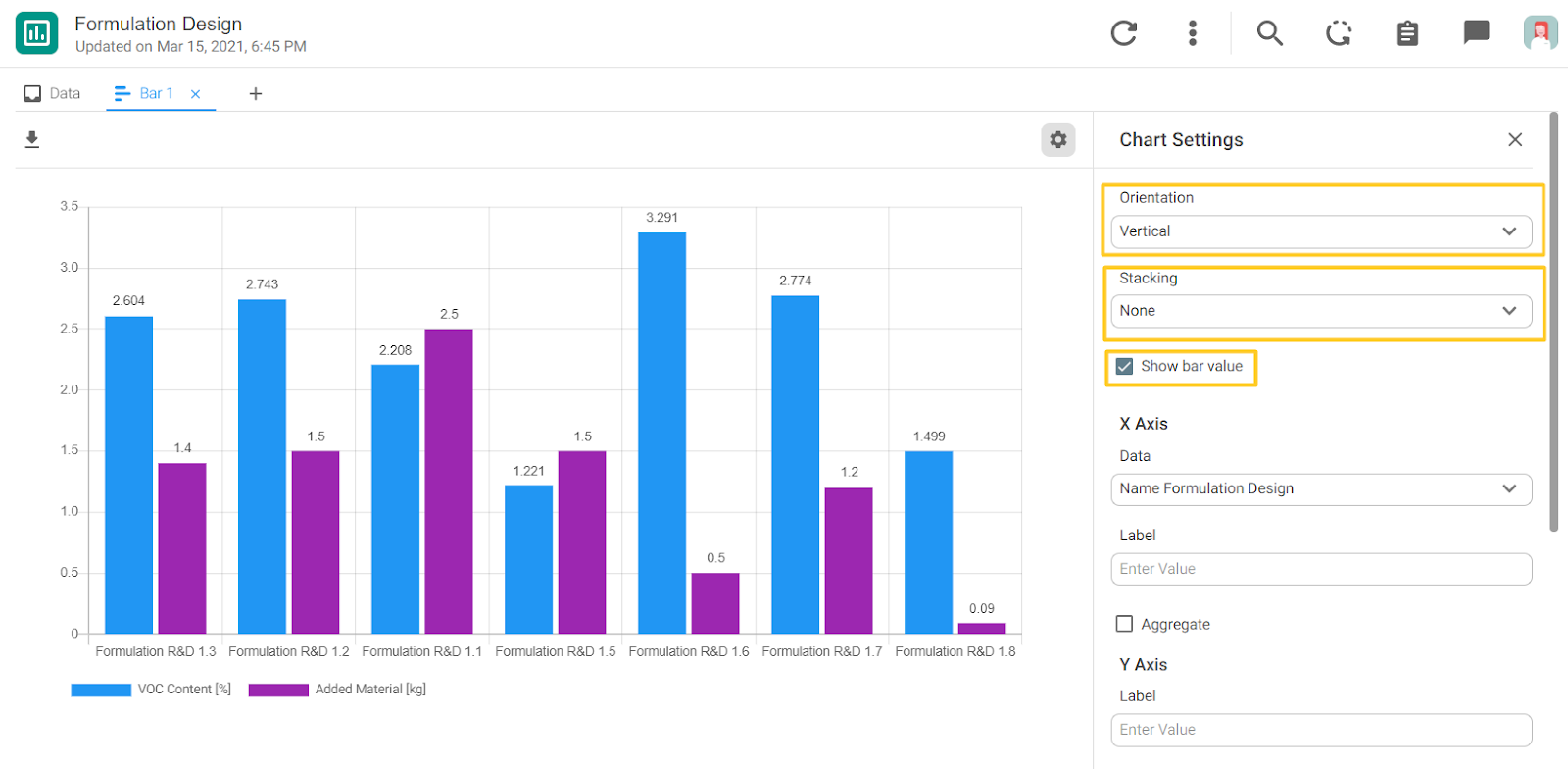
You can also add add labels for each axis:

Finally, you can change the colors of the series:
