** Reading the Manual on phones and smaller screen tablets is not recommended, since you may not enjoy the best user experience.
Please discuss how to add them to your system with your CSM or Salesperson.
Alchemy’s AI handles data selection, data preprocessing, model training, and model tuning. It trains, in parallel, over 10,000 different models and hyperparameter combinations on AWS using more than 20 machine learning algorithms to find the best fit for specific datasets, ensuring strong performance on both existing and unseen data. Model selection is refined using advanced statistical methods to reduce bias and improve performance, especially with smaller datasets. This technique helps mitigate overfitting while enhancing generalization. The selected models are then applied in another genetic algorithm to generate formulation recommendations for data exploitation. This algorithm guides the formulation toward the desired properties and also predicts property values, providing prediction intervals that reflect the uncertainty of the predictions.
Our AI-ready platform is comprised of three main components:
Alchemy’s Scan & Score functionality is able to:
Scan & Score has two purposes:
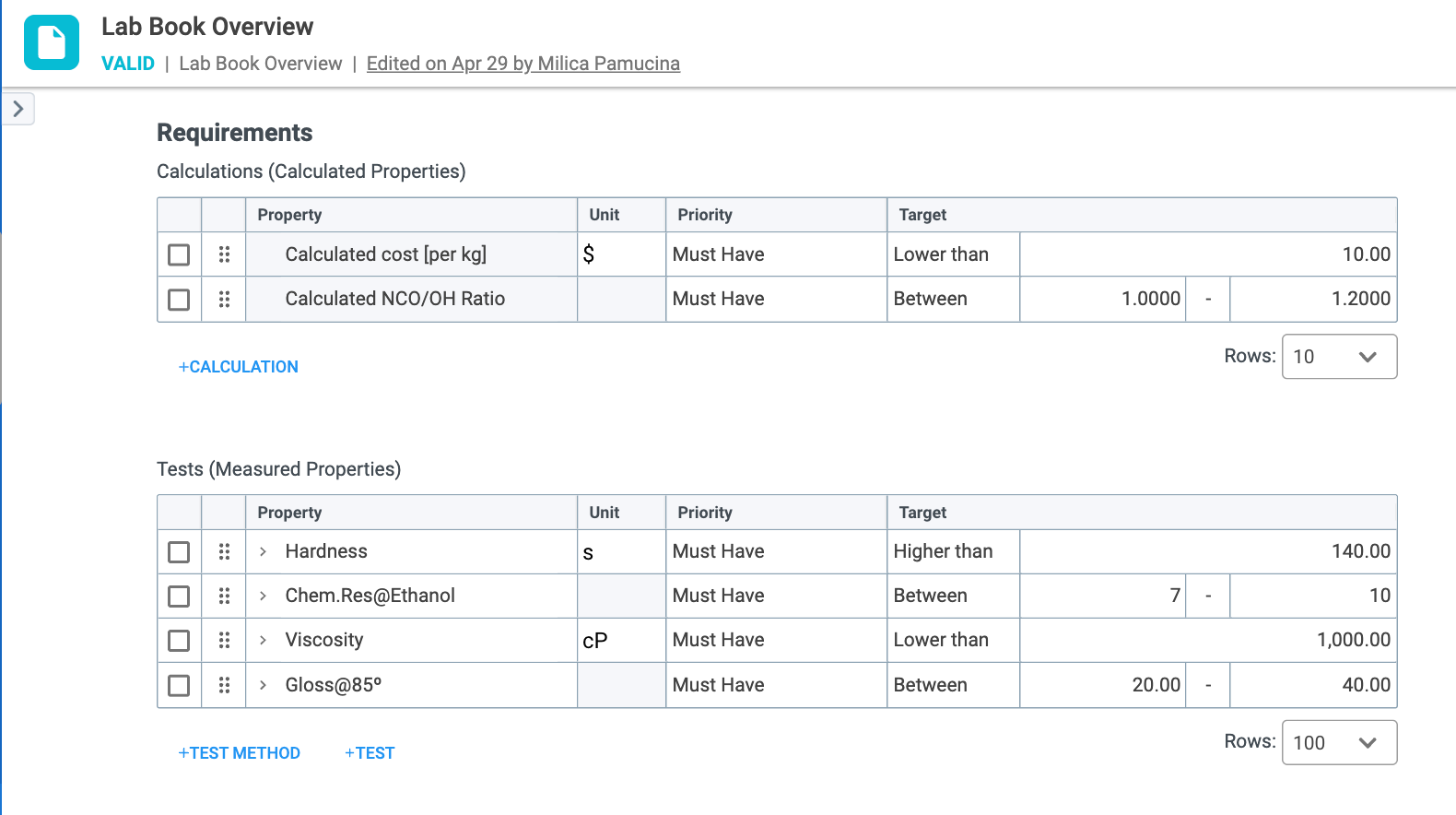
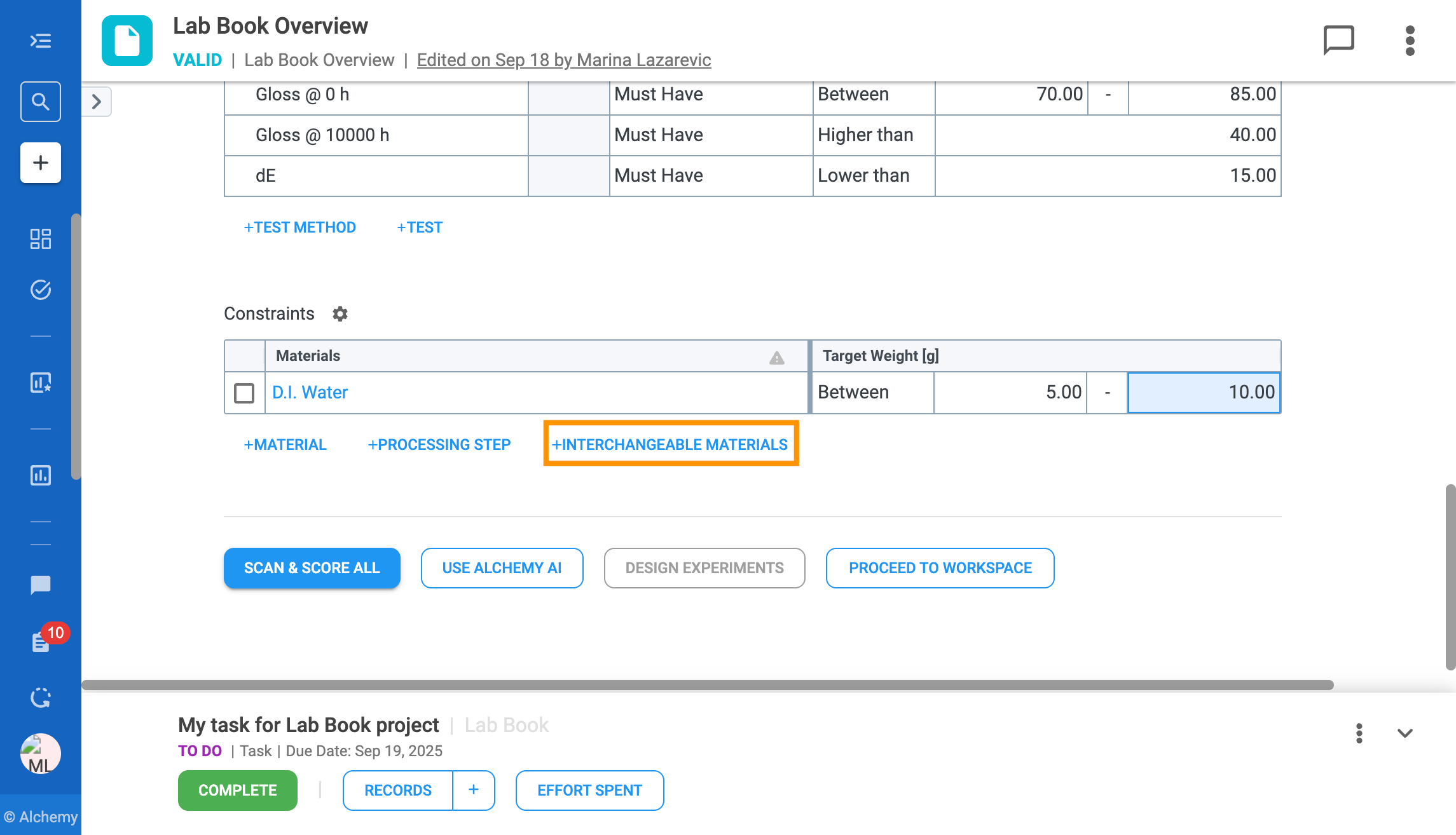
To enable Scan & Score functionality, Requirements on the Lab Book Overview record need to be defined (Figure 2.1). Available categories of requirements on the Lab Book Overview record include:
After selecting the category of requirements, you then select the priority and fill in the target.
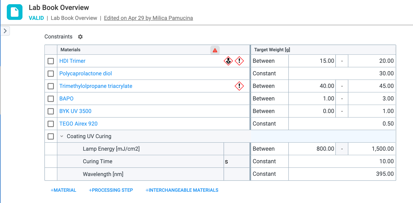
Constraints (Figure 2.2) are theoretical constraints for each material/processing step that is used in a trial. Examples include any generic materials like Water or TiO2, as well as proprietary materials that can be used as ingredients in trials. Once selected, target values must be defined as:
After the requirements and constraints on the Lab Book Overview record have been entered, the Scan & Score button can be clicked from any of the following records:
Scanning (Figure 2.3) searches for a 1:1 match for properties, along with their conditions, from the Lab Book Overview record with the properties present on the trial level. This means that:
Trials from the previous step are further filtered based on material constraints. Trials will be surfaced and filtered for scoring based on material constraints on the Lab Book Overview record:
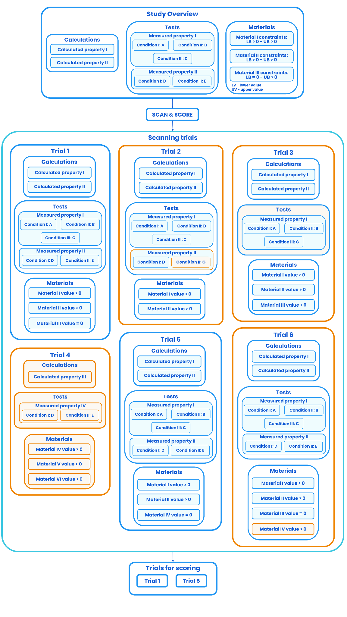
From Figure 2.3 it can be seen that scanning will surface the following trials for scoring:
Scanning will not surface the following trials for scoring:
Trials that have partial matches are surfaced and scored because they have at least one exact match for a property, along with its conditions.
Once the trials are scanned, every trial is assigned with a score based on priority and how far the values of the trials properties and materials are from the targets defined on the Lab Book Overview record.
Trials are ranked from the lowest scores, or best performing trials, to the highest scores, or worst performing trials.
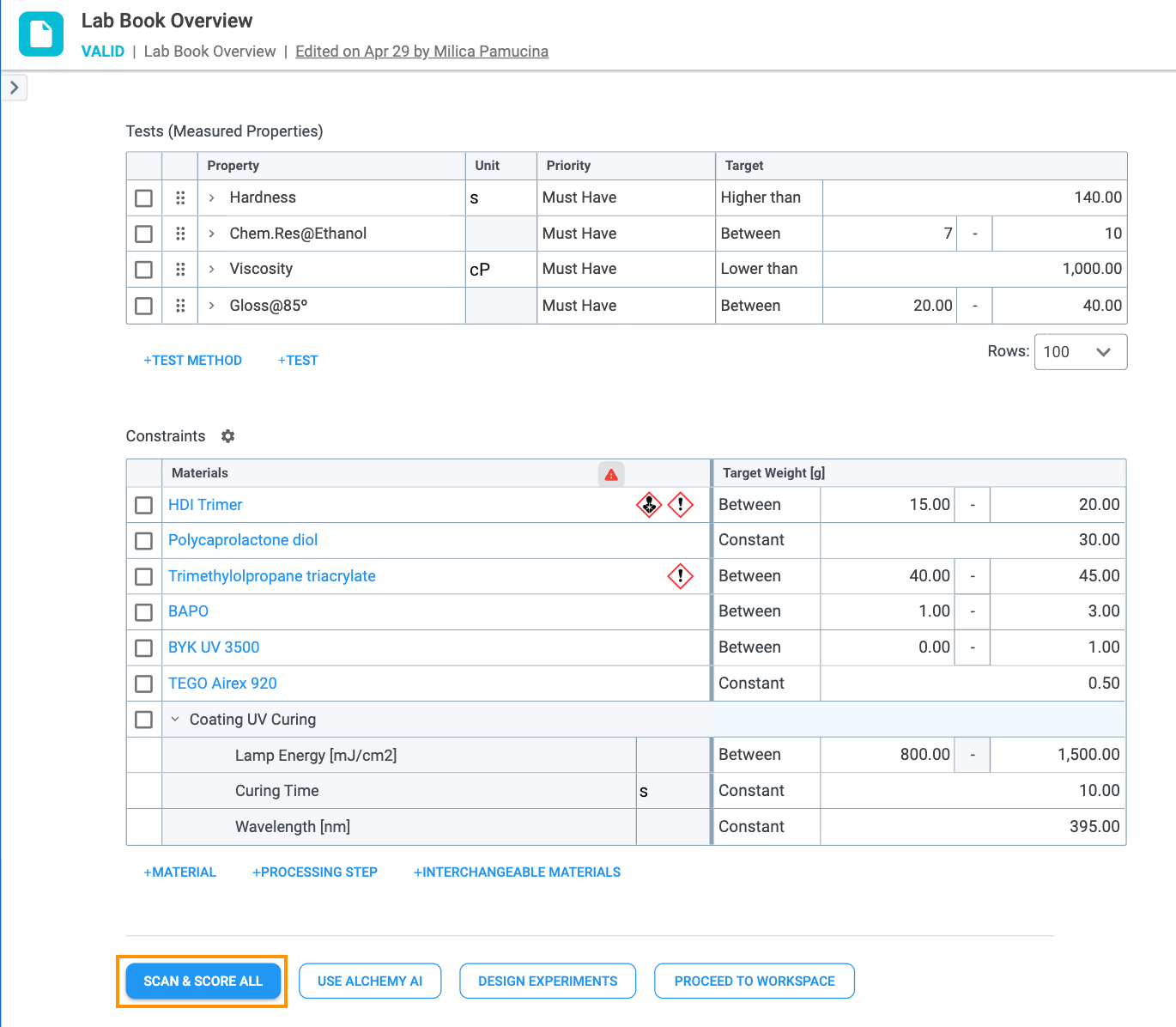
At the bottom of the Lab Book Overview record is the SCAN & SCORE ALL (Figure 2.4) button. Clicking it triggers a search of your historical database and returns a force-ranked list of Samples matching the requirements, targets, and material constraints defined on the Lab Book Overview. For this button to be enabled, at least one requirement (measured or calculated) must be added to the Requirements table in the Lab Book Overview record that has a priority of must have or nice to have. Requirements that have a no target, rate only priority will not be included in the Scan & Score functionality.
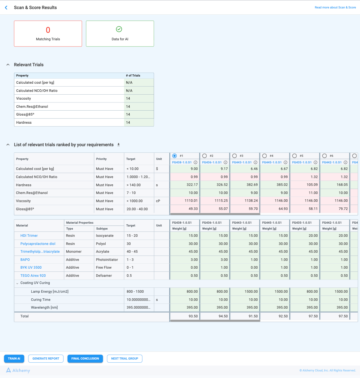
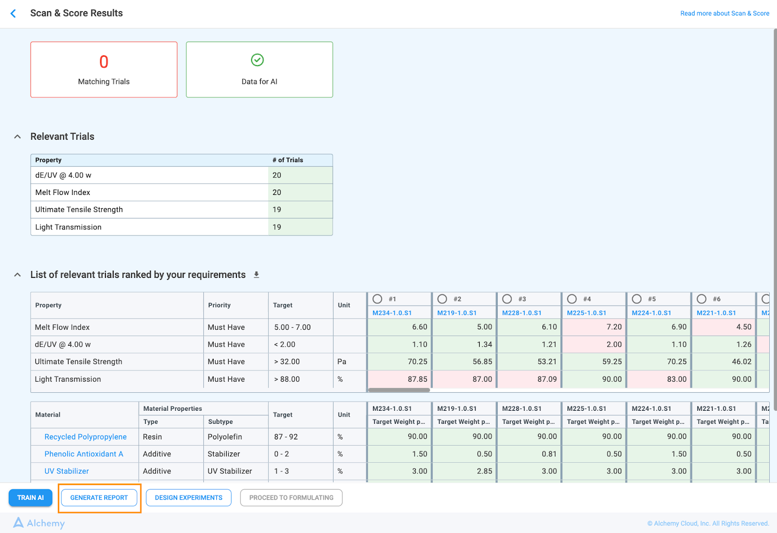
Once the SCAN & SCORE ALL button is clicked, the system navigates to a results page that displays the matching actual trials for your requirements (Figure 2.5).
The top of the page displays two boxes:
The data is deemed insufficient when the number of matching trials is below 2 × (varying constraints) + 1 for every property with a priority Must Have and Nice to Have
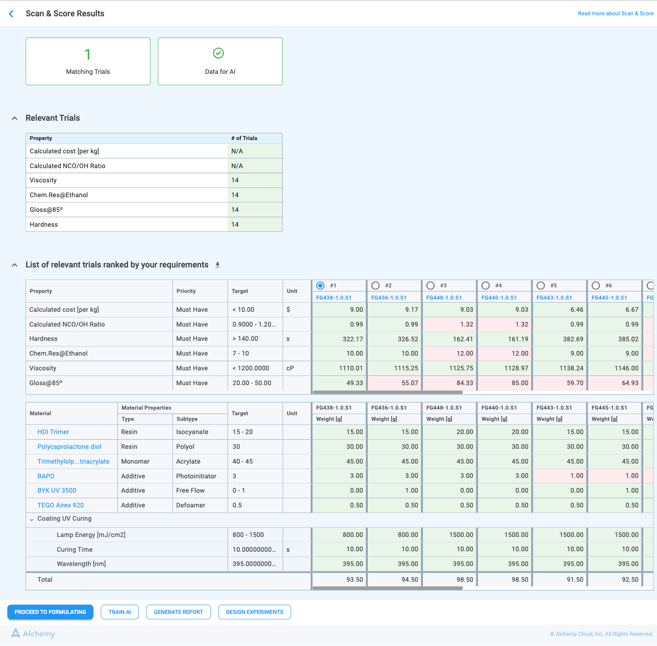
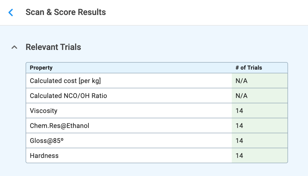
The Relevant Trials (Figure 2.6) table is shown by default and displays the total number of historical trials for each Must Have or Nice to Have property. Only trials that fully match the trial rules are counted, and this dataset can be used as a starting point for model training. The number helps users determine whether model training should be attempted or whether they should proceed directly to DOE. The table can be collapsed or expanded as needed.
For each trial in the results table, you can see:
When the desired trial is selected, the button Proceed to Formulating is enabled. Clicking on it will:
With the Starting Trial selected, the Workspace record will have:
If the Material and Processing Step Constraints table on the Lab Book Overview record is filled in, the Scan & Score will also be extended to search trials based on material constraints. Only the trials that have matching ingredients will be taken into account.
During Scan & Score, trials are ordered in two tiers: trials whose material and processing step constraints all fall within the defined targets are listed first, followed by trials with one or more constraint values outside those targets. Within each tier, trials are ranked by their performance score.
At the bottom of every Workspace record is the SCAN & SCORE THIS LAB BOOK button. Selecting it opens the same Scan & Score results page (Figure 2.5 and 2.6) that appears when the SCAN & SCORE ALL button is clicked on the Lab Book Overview record, displaying all matching trials within the current Lab Book.

However, certain conditions must be met for this feature to be enabled:
Once the Best Performing Trial is selected, two additional options are enabled:
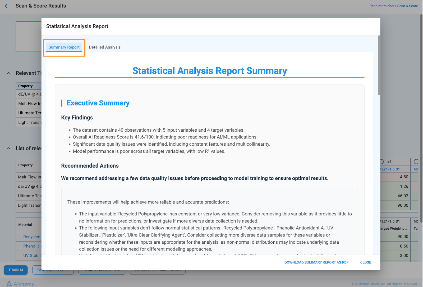
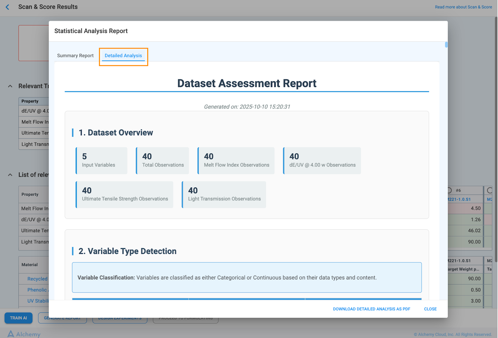
Once your dataset has been processed on the Scan & Score Results page, you gain access to an automated, human-readable report that provides deep statistical insights into your data's quality and structure. This report is essential for confirming data readiness and understanding the potential of your dataset before initiating model training.
This report provides a concise, human-readable summary of your dataset's statistical profile, its readiness for Machine Learning (ML), and specific recommended actions to maximize model performance.
This section gives you the immediate, high-level status of your dataset.
Model Performance Snapshot: Provides a quick measure of predictive capability for target properties (e.g., R2 value).
Advises users to address data quality issues before proceeding to model training to ensure more reliable and accurate predictions.
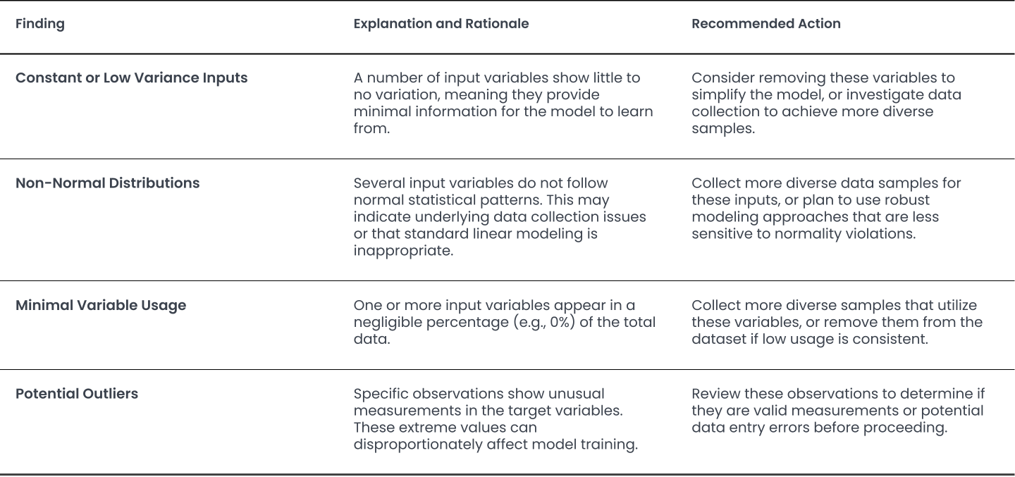
This section provides the breakdown of the AI Readiness Score and advanced statistical findings. The overall score is derived from five components, each evaluated out of 100:
The report also includes Statistical and Design Insights confirming Sample Size Adequacy, reporting Design Efficiency (G-Efficiency), listing Key Predictors based on significance and correlation, and providing Residual Diagnostics to ensure the reliability of the chosen model.
The detailed analysis is organized into the following eight comprehensive sections:
1. Dataset Overview & Data Availability
This section provides a high-level summary of the dataset's composition and completeness.
2. Variable Classification & Structure
This section confirms how the system interpreted and categorized each variable, which is fundamental for accurate modeling.
3. Dataset Quality Assessment
This critical section evaluates the robustness and quality of the data for modeling, flagging common issues that can affect model performance.
4. Experimental Design Efficiency
This section is crucial when analyzing data from Design of Experiments (DOE), providing metrics to evaluate the quality of the design itself.
5. Cluster Analysis
This section performs unsupervised learning to reveal inherent groupings within your data that may not be immediately obvious.
6. Feature Importance Analysis
This section moves beyond simple correlations to explain why and how much each input variable influences the target variable.
7. Regression Model Results
This section summarizes the performance of the predictive models automatically generated by the system.
8. Residual Analysis
This final section validates the fundamental statistical assumptions of the selected model, confirming the reliability of its results.
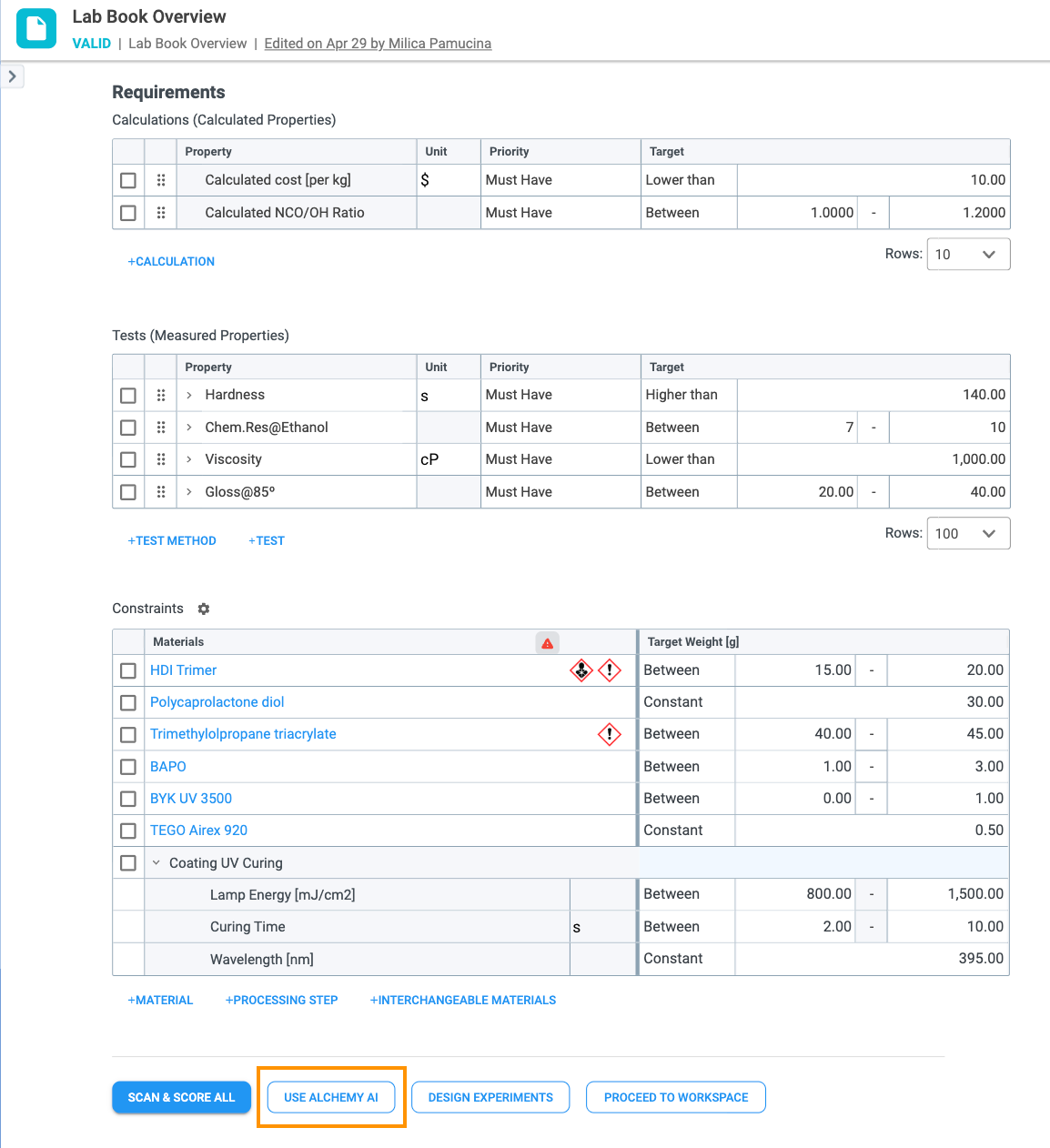
To successfully generate a meaningful statistical report, the system requires a complete definition of the variables you wish to analyze. You must define all necessary inputs (materials/processing steps) and outputs (Calculations/Tests) in the Lab Book Overview before proceeding (Check section 2.1. Scan & Score Setup).
Required Data Input: Constraints Table
Required Data Output: Tests and Calculations Tables
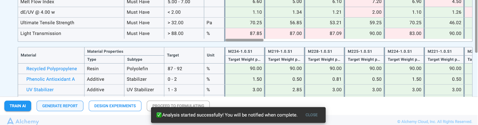
Steps to Generate the Report
Note: This process initiates the deeper statistical analysis needed for the report.

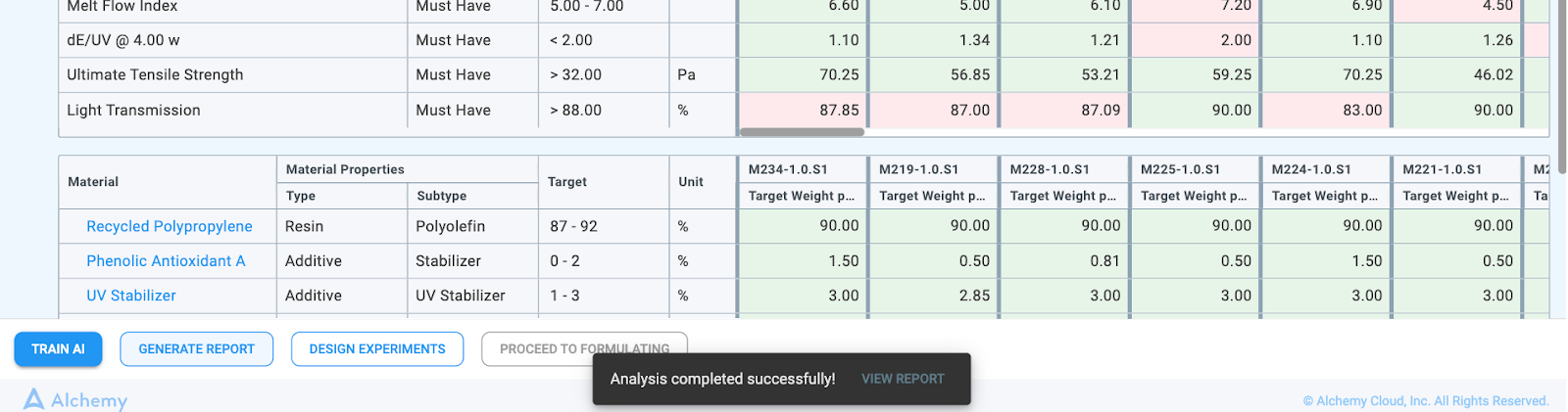
Report Access and Download
The generated report is presented in two tabs:
🔐 Please discuss how to add this to your system with your CSM or Salesperson.
Alchemy DOE (Design of Experiments) is a powerful tool that addresses the situation when there is little to no historical data, preventing the system from running AI. It will help you extend your dataset in the most efficient manner possible (i.e., with the smallest, well-distributed, statistically optimal dataset) so that Alchemy can train models and run AI.
No prior experience with machine learning, data science, or statistics is required to use DOE. Any chemist or scientist will be able to input their formulating objectives and constraints to be guided in the most efficient manner to achieve their goals.
A traditional method for experimenting is One Variable at a Time (OVAT) in which one variable is varied, while all others are kept constant, and its influence is assessed on the target properties (Figure 3.1).
Design of Experiments is a method in which all variables are changed at the same time and their influence is assessed on the target properties. It proposes testing of the most informative locations in the design space which are focused towards the interpretability of the process and space, filling the design space (Figure 3.1).
In Table 3.1, OVAT and DOE experiments are compared based on different characteristics.
One Variable at a Time Design of Experiments

Yes
Yes
Better than OVAT
Better filled design space
Faster (with the help of predictive models)
Number of experiments increases fast with increasing the number of input variables
Better accuracy throughout different regions of design space
The main types of designs available in Alchemy are:

At the bottom of the Lab Book Overview record, you can find the Design Experiments button. It is possible to create designed experiments when:
Once the button is clicked, the Design Experiments modal will be opened with the following information:

Screening Design is intended to identify significant main effects from a list of many, potentially varied, materials.
The goals of screening design are to reduce the size of the design space through:
The subtypes of screening designs available in Alchemy are:
From the Design Experiments modal, when the Screening Design is selected as a type and you click on the Generate Formulations button, a new Workspace record will be created. This action can take some time since Alchemy is potentially creating a lot of new theoretical and actual formulations. While they are being created, this message will be displayed in your Lab Book:

Once the Workspace record is created, it will have the following:

After performing the screening design, the effects of each input variable are assessed by statistically determining if an ingredient has significant or no effect on a specific performance characteristic. Based on this information, users should be able to reduce the number of input variables they want to vary, reducing the problem space and the required number of experiments for a more in-depth exploration of the design space for optimization purposes.
You will be able to run the analysis when all actual trials (samples) have entered values and all test results are entered. Then the Analyze Screening Design button below the Tests table will become available.

Clicking this button will create a detailed analysis table to help you better understand the problem space and try to decrease it, if possible, for the optimal or adaptive design. In this table, you can see the following:

Below the Analysis table, a copy of the Material Constraints table from the Lab Book Overview record will be displayed, giving you the possibility to reduce the number of varying materials and/or conditions from processing step constraints (the one with targets defined as “between”). Reducing this number is beneficial since you will be able to use different types of designed experiments, and, eventually, become able to get the recommended trials by Alchemy AI.

After the Analysis is created, at the bottom of the Workspace record, you can perform the following actions:
Optimal design is intended to fill the design space with experimental points. Because it requires more experiments to be performed, it is normally done if the problem space is initially small enough or if the problem space has been reduced by executing a screening design.
The goals of optimal design are to:
The subtypes of optimal design available in Alchemy are:
When you click on the Design Experiment button in the Lab Book Overview record, or Continue Design of Experiment in the Workspace record, if you have fewer than five varying material and/or conditions from processing step constraints (or you reduced them to fewer than five), the Optimal design will be the preselected type. The rest of the modal will look the same as displayed when Screening design was selected.
Similarly, when creating a Screening design Workspace record, once you decide to continue with the Optimal design, the new Workspace record will be created for you. This action can take some time since Alchemy potentially creates many new theoretical and actual formulations. While they are being created, this message will be displayed in your Lab Book:

Once the Workspace record is created, it will have the following:

At Alchemy, our machine learning (ML) models use input and output variables for training to recognize certain types of patterns and make predictions. Alchemy AI (Figure 4.1) uses two types of ML algorithms depending on the type of output variables:
Alchemy’s AutoML module consists of 13 different algorithms for regression and 10 different algorithms for classification, which are trained in parallel in order to significantly shorten the training duration.

A dataset consists of input and output variables.
Input variables are independent variables whose values are measured and input by the user. In Alchemy, input variables are:
Output variables are variables which depend on input variables. In Alchemy, output variables are:
A dataset for training AI in Alchemy is surfaced through Alchemy’s Scan and Score or Alchemy AI functionality. These tools give information about the:
The Show More Details button displays the number of available trials for each property separately.
Train AI in Alchemy consists of:
Hyperparameter tuning is a process which includes searching for the hyperparameters that will produce the highest performance of the models for each ML algorithm.
In Alchemy, performance of ML models are evaluated through repeated k-fold cross validation.
In k-fold cross validation, the dataset is split into k numbers of sets and each time one set is held back and models are trained with the remaining sets. Held back sets are used for performance estimation. This means that a total of k models are fit and evaluated based on the performance of mean value of held back sets. This process is repeated l times with different splits, depending on how large the dataset is. In addition, l ✕ k number of models are fitted with repeated k-fold cross validation for estimating the performance of ML models.
The process of model training is shown in Figure 4.2.

In Alchemy, selection of the best model is automatically made for each target property. Automatic selection of the best model consists of the following steps:
For automatically choosing the best model (Figure 4.3 and Figure 4.4), different performance metrics are used.


It is important that we track performance metrics to validate the models we generate in terms of the accuracy of predicted values.
First, a couple definitions:
Performance metrics for regression models available in Alchemy are:
$$R^2=1-\frac{\sum_{i=1}^N\left(y_i-\hat{y_i}\right)^2}{\sum_{i=1}^N\left(y_i-\bar{y}\right)^2}$$
${N}$ - number of trials
1. R2 (coefficient of determination):
$y_i$ - actual value
$\widehat{y_i}$ - predicted value
$\bar{y}$ - average of all actual values
2. MAE (mean absolute error):
$$M A E=\frac{1}{N} \sum_{i=1}^N\left|y_i-\widehat{y_i}\right|$$
${N}$ - number of trials
$y_i$ - actual value
$\widehat{y_i}$ - predicted value
3. RMSE (root mean squared error):
$$R M S E=\sqrt{\frac{1}{N} \sum_{i=1}^N\left(y_i-\widehat{y}_i\right)^2}$$
${N}$ - number of trials
$y_i$ - actual value
$\widehat{y_i}$ - predicted value
Performance metrics for classification models available in Alchemy are:
1. Accuracy:
$$Accuracy =\frac{\text { Number of correct predictions }}{\text { Total number of predictions }}$$
2. Average Precision:
$$Average Precision =\sum_{k=1}^N \operatorname{Precision}(k) \Delta \operatorname{Recall}(k)$$
${N}$ - number of trials
$Precision(k)$ - is the precision at a cutoff of k
$\Delta Recall(k)$ - is the change in recall that happened between cutoff k-1 and cutoff k
3. F1 Score:
- Precision: accuracy of positive predictions, which is the ratio of true positive predictions to the total number of positive predictions made by the model and
$$Precision_{classI}=\frac{TP_{classI}}{TP_{classI}+FP_{classI}}$$
${Precision_{classI}}$ - precision for one class, there are as many classes as there are predefined values
${TP_{classI}}$ - true positives for class I, number of trials which were predicted correct for class I (predicted class I matched the actual class I)
${FP_{classI}}$ - false positive for class I, number of trials which were predicted incorrect to belong to class I (predicted class I did not match the actual class)
- Recall: ratio of true positive predictions to the total number of actual positive instances in the dataset
$$Recall_{classI}=\frac{TP_{classI}}{TP_{classI}+FN_{classI}}$$
${FN_{classI}}$ - false negative for class I, number of trials which were predicted incorrect to belong to another class (predicted class did not match the actual class I)
$$F1score_{class~I}=\frac{2\times Precision_{class~I}\times Recall_{class~I}}{Precision_{class~I}+Recall_{class~I}}$$
4. ROC AUC Score (area under the receiver operating characteristic curve):
At Alchemy, we strive to achieve three goals when models are trained:
All predicted property values have associated predicted confidence intervals which will show how much deviation can be expected from the predicted property value for a certain trial.
Alchemy's Machine Learning functionality — exposed through the Use Alchemy AI button — trains predictive models on your historical trial data and uses them either to recommend new formulations that are most likely to meet your requirements (when model confidence is high) or to recommend exploratory experiments that increase model accuracy in regions where it is currently weak (when model confidence is low). The workflow covers four stages:
Before launching Alchemy AI, the Lab Book Overview record must be set up so the system has both the inputs and the outputs needed to train predictive models. The same setup described in Section 2.1 Scan & Score Setup applies here.
Required inputs — Constraints table
Required outputs — Requirements table (Calculations and Tests)
Sufficient historical data
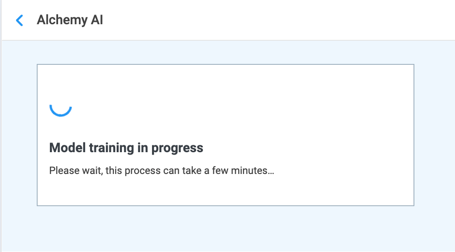
At the bottom of the Lab Book Overview record is the Use Alchemy AI button (Figure 4.5). What happens when you click it depends on whether models have already been trained for this Lab Book:
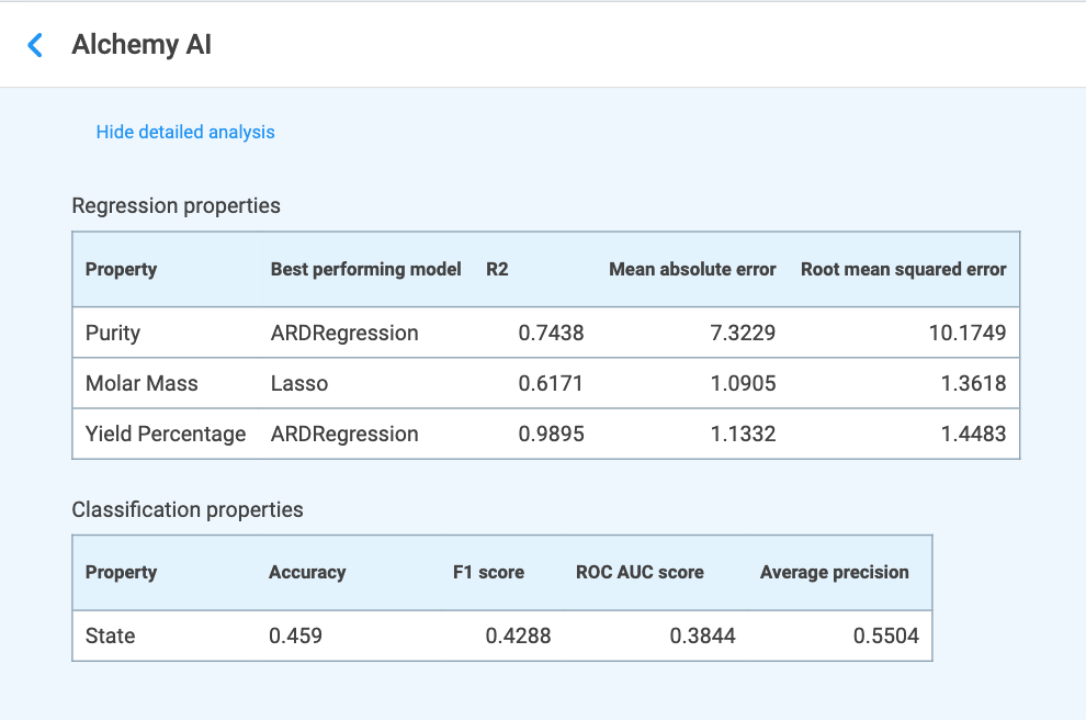
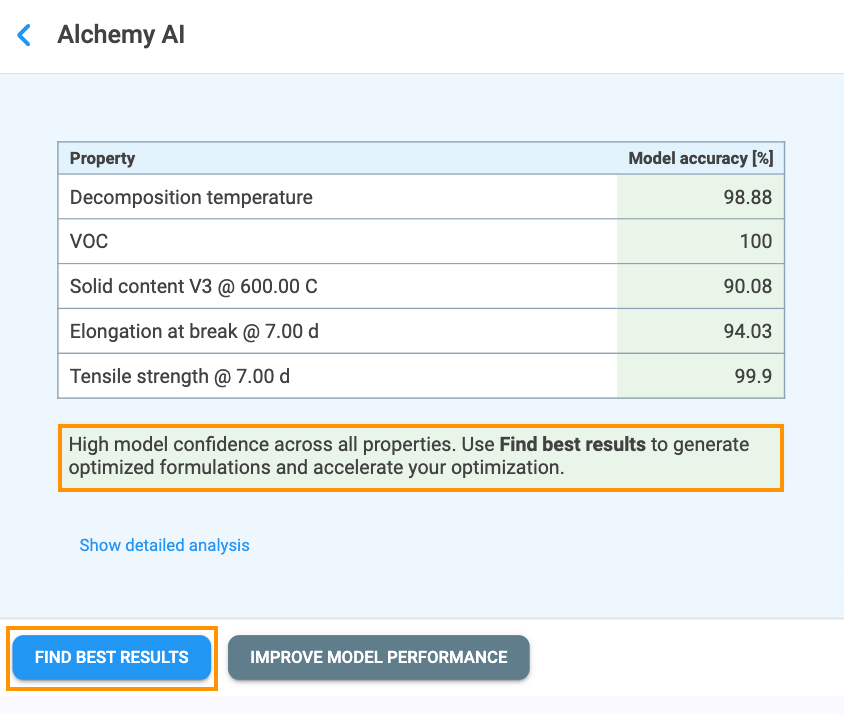
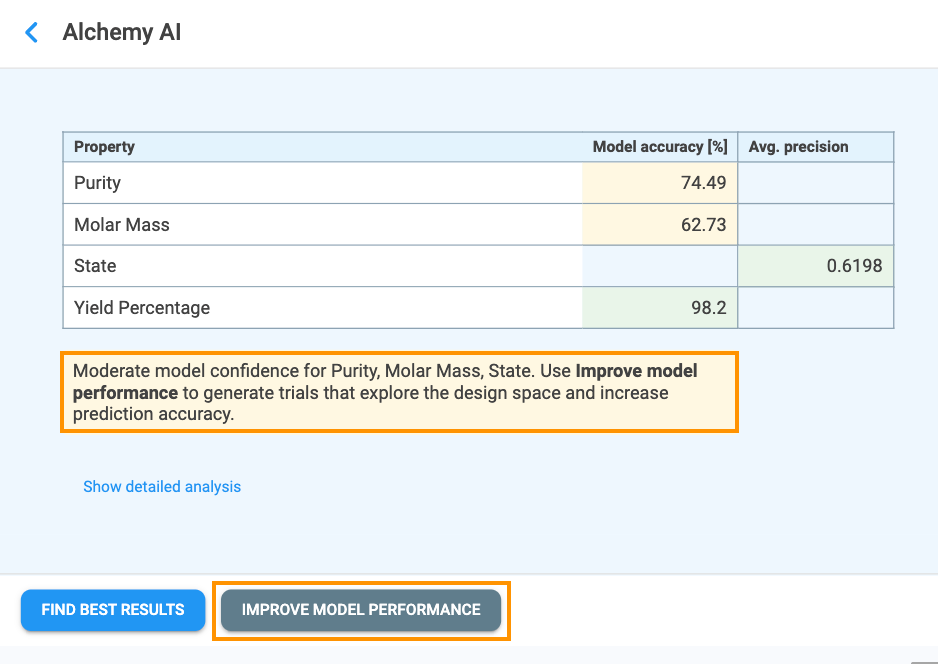
Once training is complete, the Alchemy AI results page opens (Figure 4.7). The top of the page displays the model performance table, which lists every Must Have and Nice to Have property together with a headline score for its best-performing model. The columns shown depend on the type of target:
Cells are color-coded to make it easy to assess model quality at a glance:
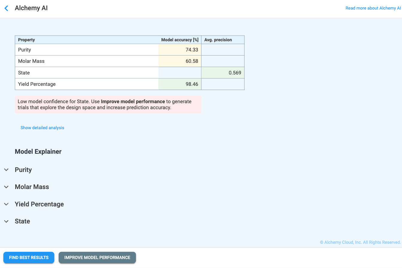
Guidance message
Below the model performance table, Alchemy displays a guidance message that recommends the next action based on overall model confidence:
"High model confidence across all properties. Use FIND BEST RESULTS to generate optimized formulations and accelerate your optimization."
"Low or Moderate model confidence for {property_name}. Use IMPROVE MODEL PERFORMANCE to generate trials that explore the design space and increase prediction accuracy."
Where {property_name} is replaced with the name (or comma-separated names) of the underperforming property or properties. The two action buttons — Find Best Results and Improve Model Performance — are always shown together at the bottom of the page; the button matching the recommended action is rendered in primary (filled) style and the other in secondary (outlined) style, so the suggested next step is visually emphasized.
Detailed analysis — Regression and Classification properties
Clicking Show detailed analysis expands the headline table into two tables (Figure 4.8) that report the chosen model and its full set of metrics for each target property:
Definitions for these metrics are given in Section 4.3 Performance Metrics. Use these tables to confirm that the chosen model and its error/score values are acceptable for your use case before generating formulations. Clicking Hide detailed analysis collapses the tables again.
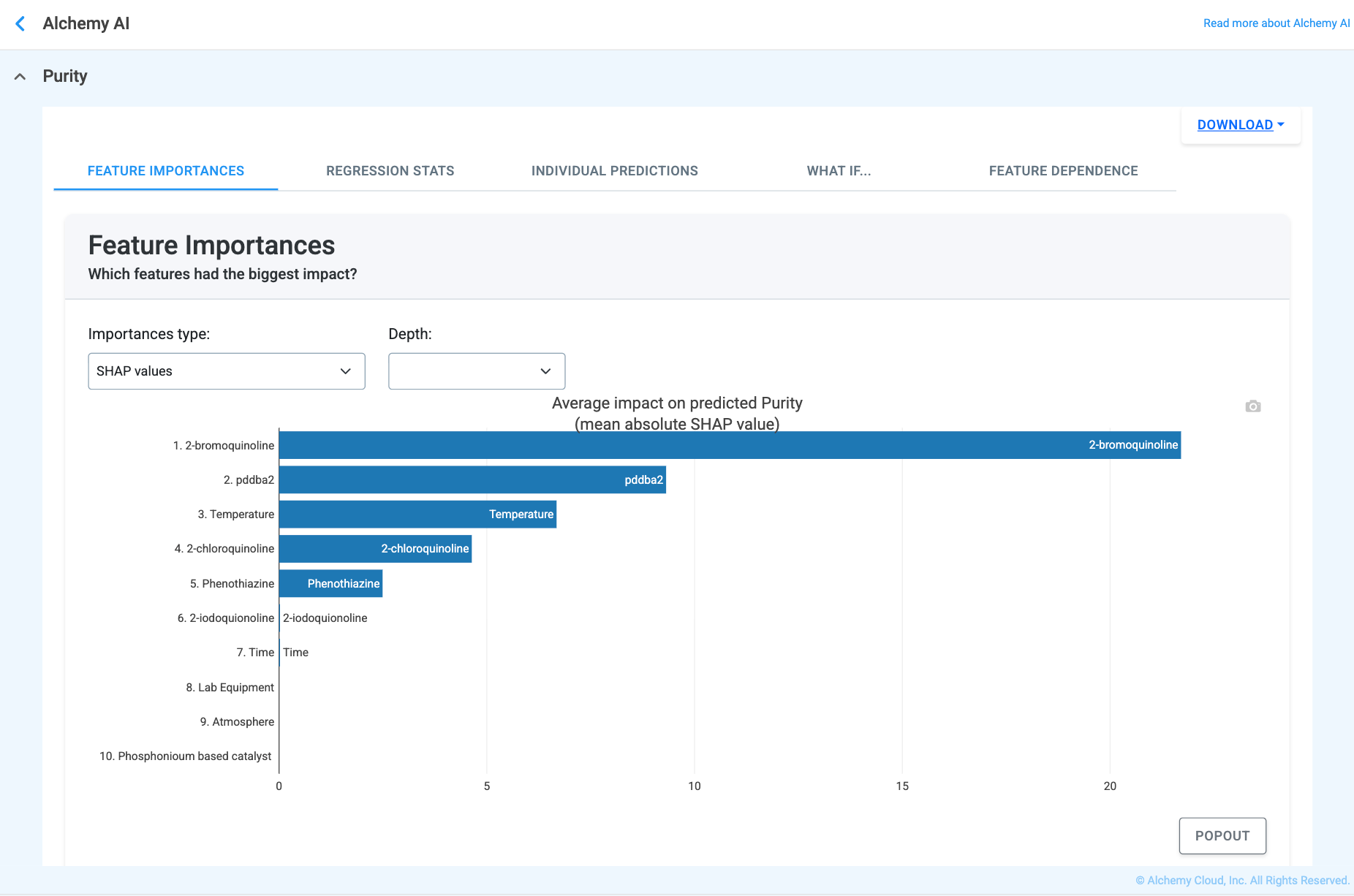
The Model Explainer section below the performance tables lists every target property as a collapsible entry. Expanding a property opens a tabbed view that lets you inspect the model from several angles — from the most influential inputs through to per-trial predictions and "what if" scenarios. The exact set of tabs depends on whether the property is regression-based or classification-based:
The Feature Importances, Individual Predictions, What If…, and Feature Dependence tabs work the same way for both target types; only the Stats tab differs. A Download button in the top-right of the Model Explainer panel exports the current view for offline review or sharing.
The Feature Importances tab answers the question “Which materials and processing steps matter the most?” and ranks every input variable by its overall impact on the model's predictions. Two scoring methods are available:
Switch between the two methods using the Importances type dropdown to cross-validate the ranking of influential features. The Depth dropdown can be used to limit how many features are shown.
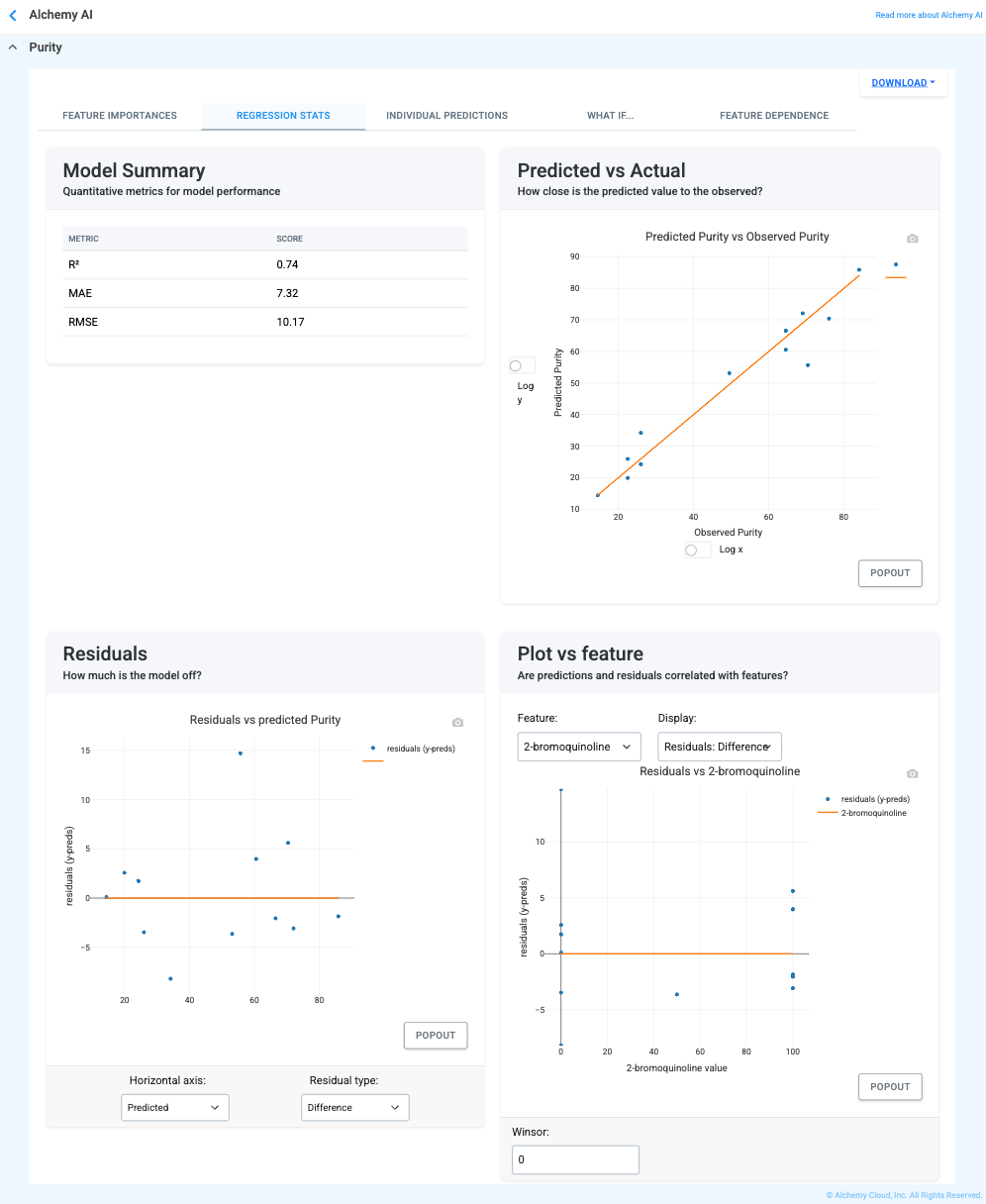
The Regression Stats tab (Figure 4.10) provides formal validation of model quality for the chosen target. It includes:
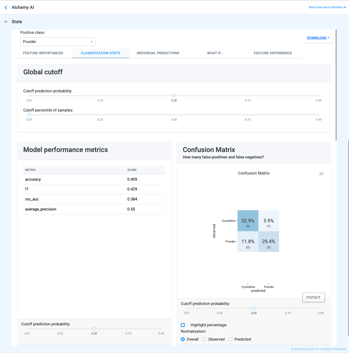
For classification targets, the Stats tab is replaced with Classification Stats, which validates the model's ability to distinguish between classes. It contains:
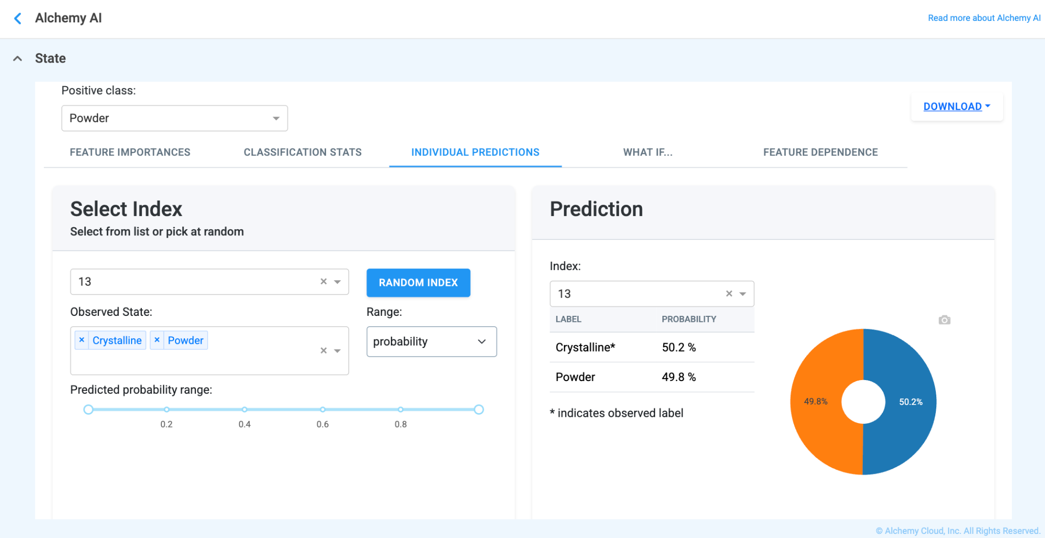
The Individual Predictions tab lets you inspect the model's prediction for any specific trial in the training set, and explains why the model produced that prediction. The view differs slightly between regression and classification:
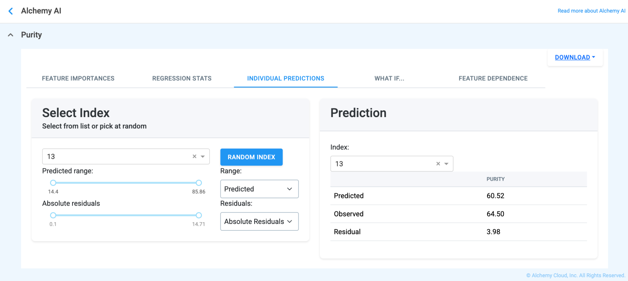
Two further plots help explain how the model arrived at the displayed prediction:
The What If… tab (Figure 4.17) lets you run virtual experiments without leaving the application. Pick a baseline trial via the Select Index dropdown, then edit any of the values in the Feature Input section — numeric inputs (e.g., material amounts, temperature, time) accept any numerical value, and categorical inputs (e.g., Atmosphere, Lab Equipment) use a dropdown.
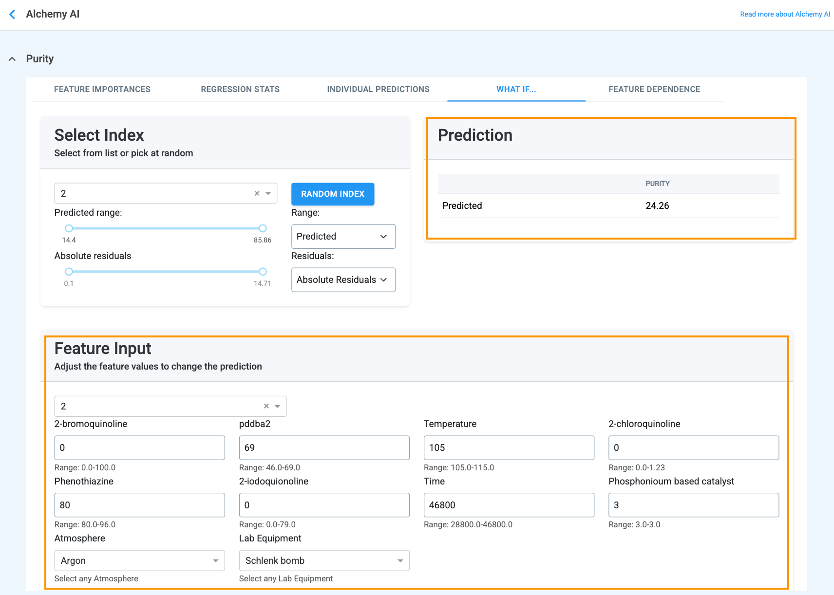
When the feature value is adjusted, the Prediction box updates instantly:
This view supports both target-seeking (“what do I change to hit this spec?”) and sensitivity analysis (“how much does this property move when I push that input by 10%?”) without spending lab resources on a physical trial.
The Feature Dependence tab (Figure 4.19) shows how a chosen input feature relates to its impact on predictions across the whole dataset, and how that impact is modulated by a second feature. It contains two paired views:
Use the Find Best Results path when overall model confidence is high (the guidance message recommends it) and you are ready to ask Alchemy AI for the formulations most likely to satisfy your defined targets.
Click the Find Best Results button at the bottom-left of the results page. A "Generating formulations — Please wait, this process can take a few minutes…" loading message is displayed (Figure 4.20) while Alchemy runs its genetic algorithm on top of the trained models to produce formulation recommendations that optimize toward the defined targets.
When generation is finished, the AI recommended trials page appears (Figure 4.21). The page is headed "AI recommended trials ranked by your requirements:" and is organized as follows.
Header row
Properties table
The first table lists every Must Have and Nice to Have property, showing the target you defined alongside each formulation's predicted value and prediction interval:
Materials and processing steps table
The second table lists every material and processing step from the Constraints table alongside each formulation's recommended weight or setting:
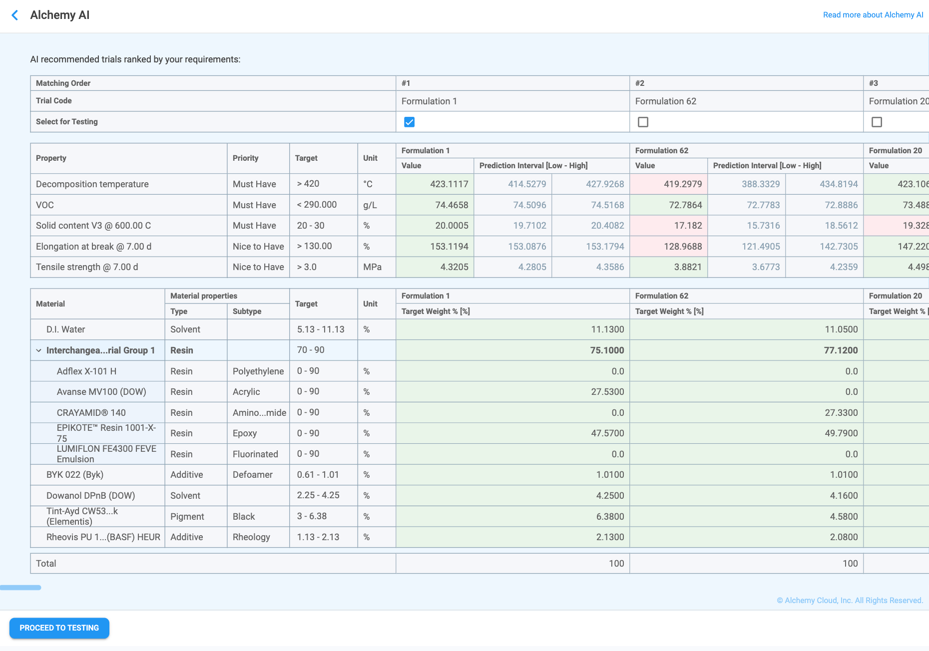
Selecting trials and proceeding to testing
Tick the Select for Testing checkbox for each formulation you want to test in the laboratory — more than one formulation can be selected. Once at least one formulation has been selected, the Proceed to Testing button becomes active (Figure 4.21). Clicking it closes the AI recommended trials page and creates a new Workspace record containing the selected formulations as actual trials, pre-populated with the recommended material weights and processing-step settings, so laboratory test results can be recorded against them.
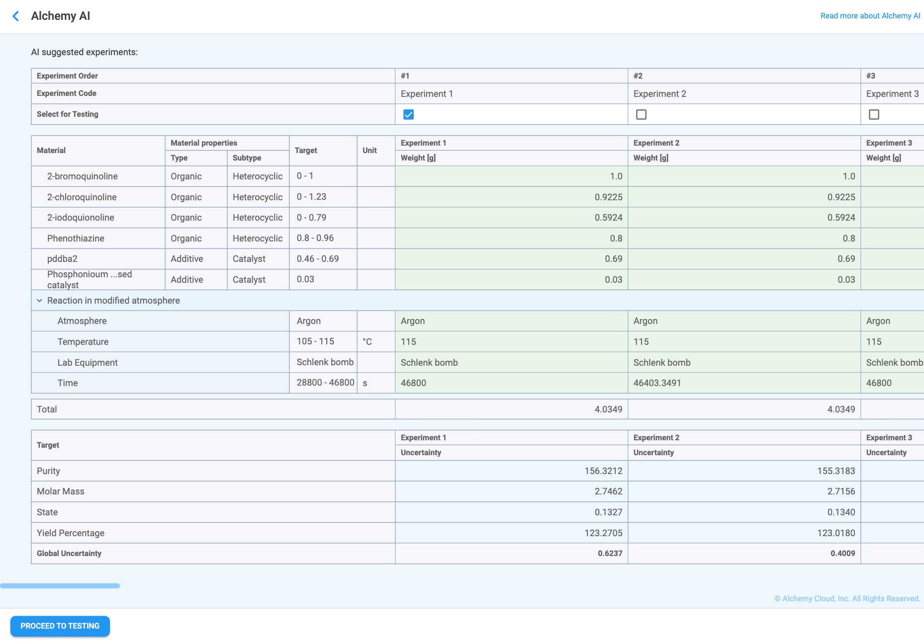
Use the Improve Model Performance path when at least one trained model has low or moderate confidence (the guidance message recommends it; see Figure 4.22). Instead of optimizing toward the targets, this path generates an adaptive design — a small set of new experiments placed in regions of the design space where the model is uncertain or where feature interactions are not yet well understood. Testing those experiments and re-training the models tightens predictions in the weakest areas, so that subsequent Find Best Results runs can be trusted.
How adaptive design works. Adaptive design replaces the traditional one-shot experimental matrix with a sequential strategy in which additional data points are placed where the predictive model shows the largest variance, so each new experiment gives the model the most information possible.
Running Improve Model Performance
Click the Improve Model Performance button at the bottom of the results page (Figure 4.22). A "Planning next experiments — Please wait, this process can take a few minutes…" loading message is displayed while Alchemy plans the next set of experiments.
When the planning step is finished, the AI suggested experiments page appears (Figure 4.23). The page is organized differently from the Find Best Results page (Figure 4.21, Section 4.5.5): the Materials and processing steps table is shown first, followed by the Properties table with per-property Uncertainty values and a Global Uncertainty score for each experiment. This ordering reflects the purpose of the page — the suggested experiments are not the ones predicted to best meet the targets, but deliberately exploratory experiments designed to reduce uncertainty in the underperforming models.
Header row
The header identifies each suggested experiment:
Materials and processing steps table
The first table lists every material and processing step from the Constraints table alongside each experiment's recommended quantity or setting:
Properties table
The second table reports the model's uncertainty for each Must Have and Nice to Have property in each experiment, plus a single Global Uncertainty score per experiment:
Unlike the Find Best Results page, no prediction interval is shown on this page — the goal is to surface where the models are weakest, not to predict an outcome with confidence.
Selecting experiments and proceeding to testing
As with Find Best Results, tick the Select for Testing checkbox for each experiment you want to run. Any number of experiments can be selected. Once at least one experiment has been selected, the Proceed to Testing button at the bottom-left of the page becomes active. Clicking it closes the page and creates an AI Generated Workspace containing the selected experiments as actual trials, ready to be tested in the laboratory.
After the laboratory results are recorded, return to the Alchemy AI page and re-train the models. The new data should improve the performance of the previously underperforming properties; once their performance crosses the 80% threshold, the guidance message will switch to recommending Find Best Results, and you can move on to optimization.
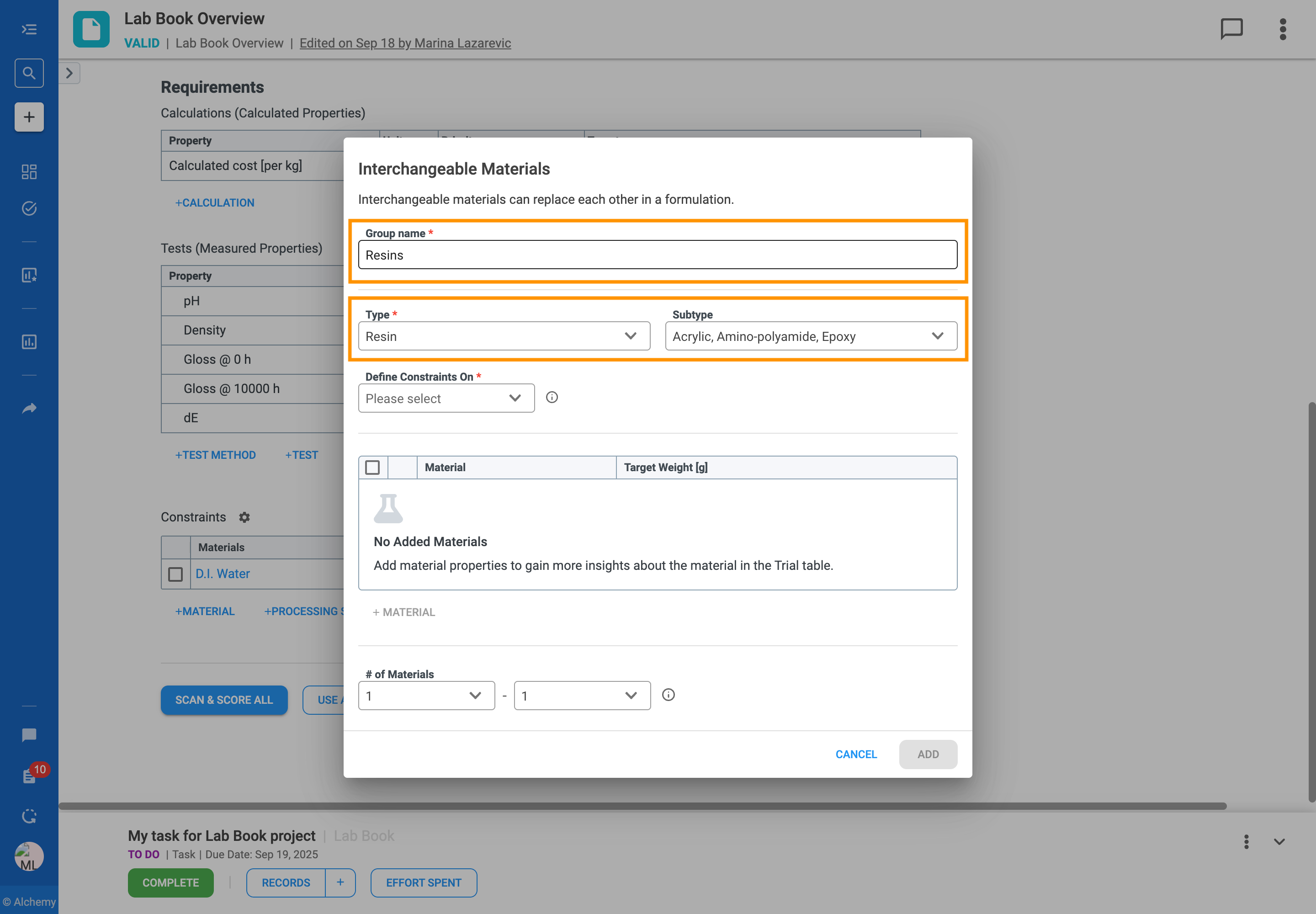
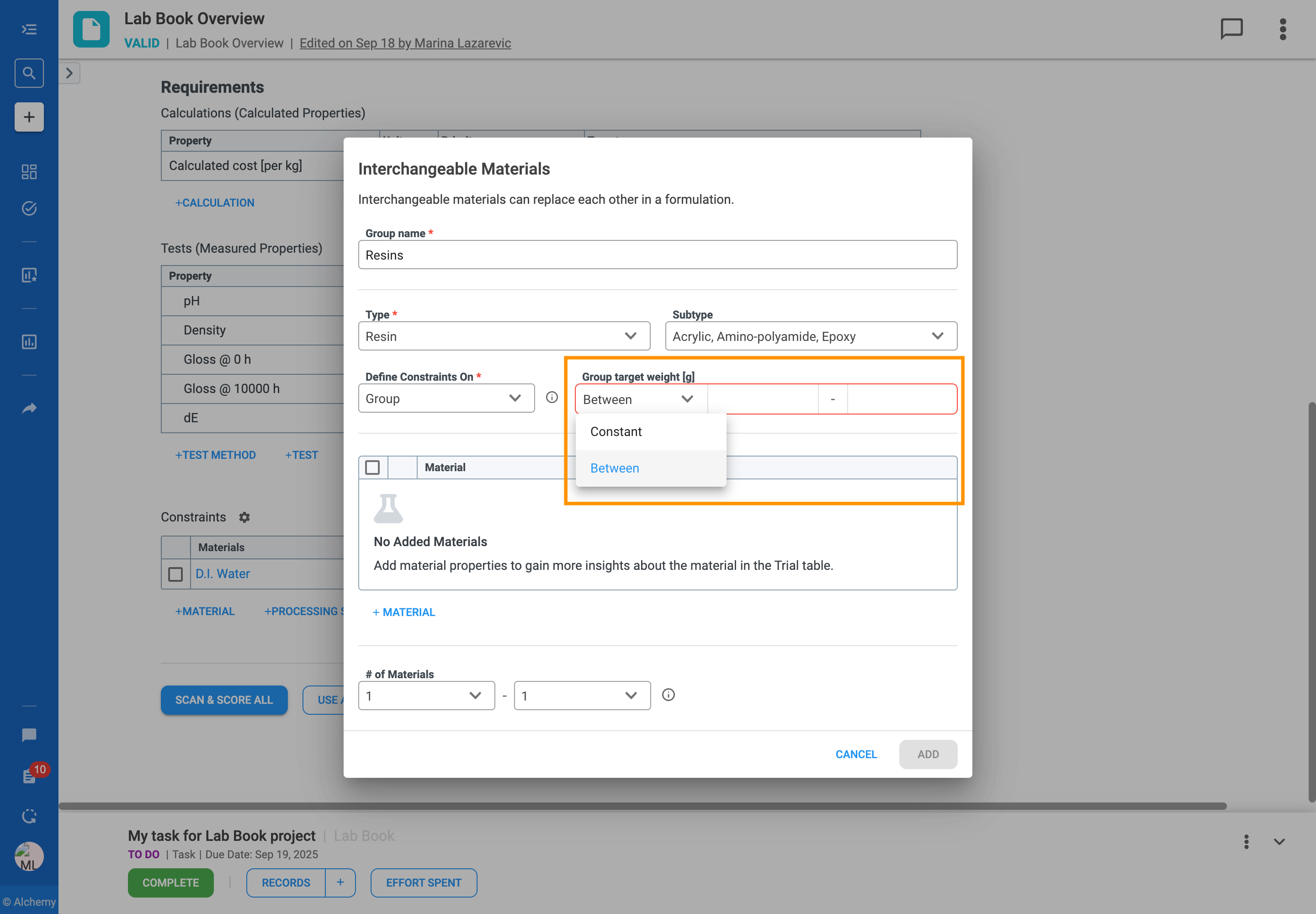
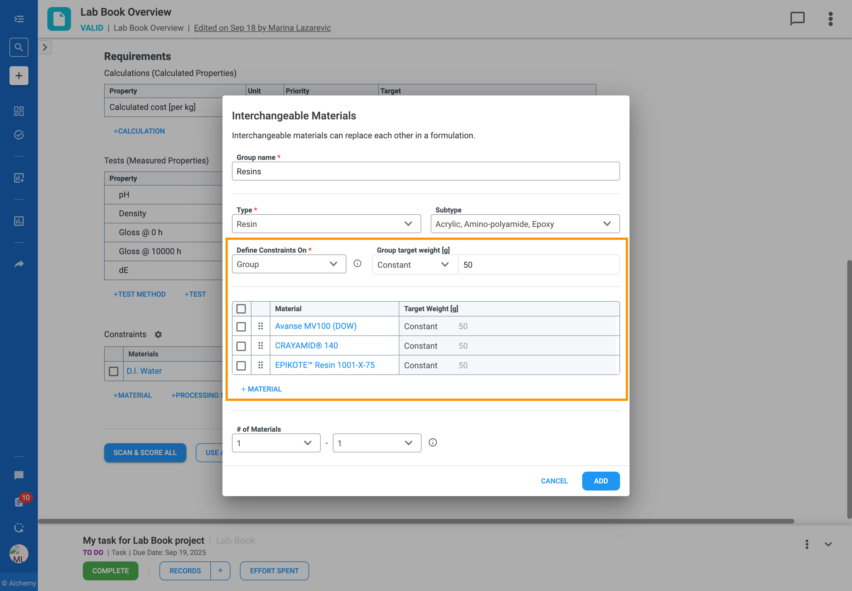
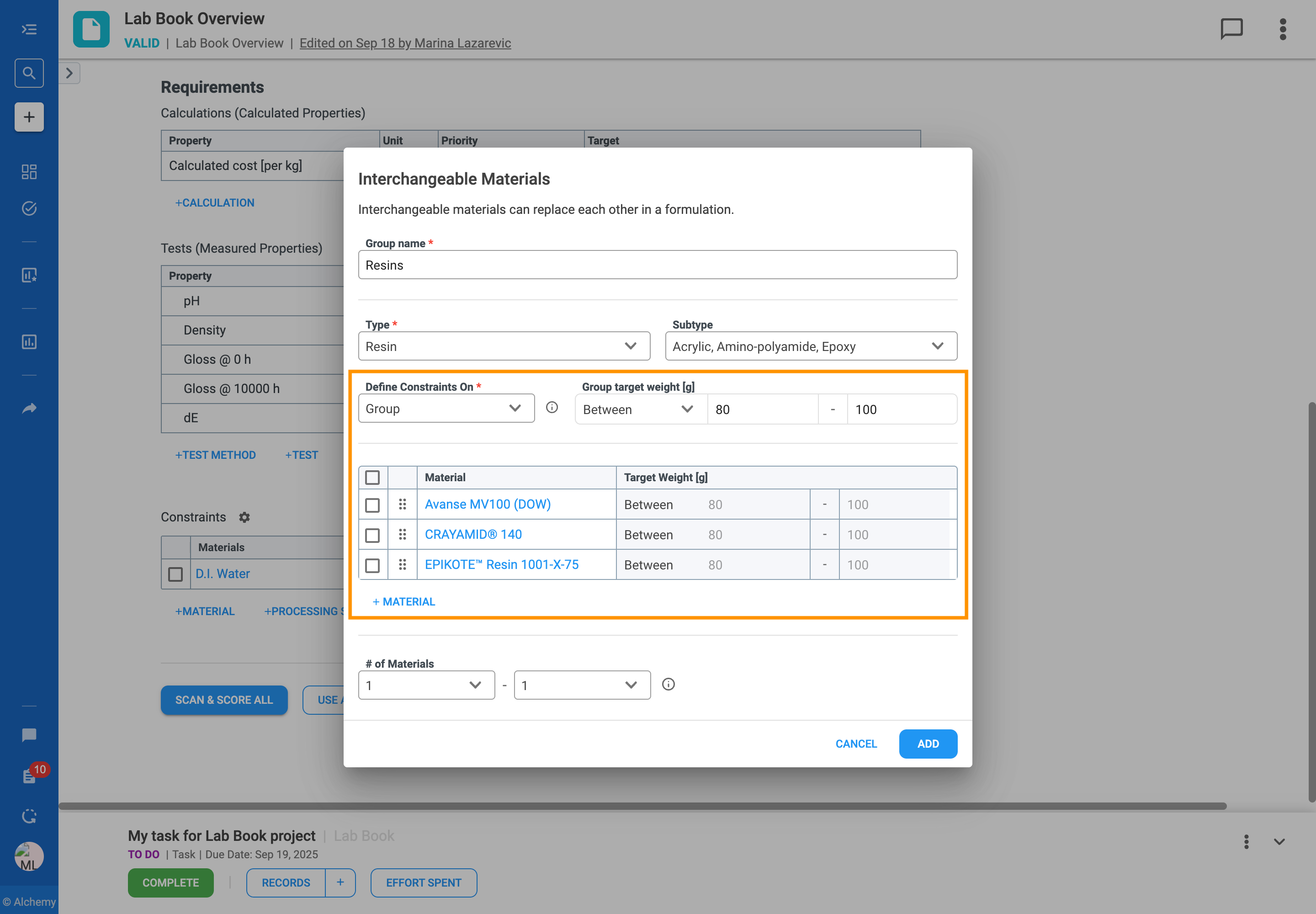
In formulation development, you often work with a set of similar ingredients that can be used in place of one another. For example, you might have several solvents that are functionally equivalent but have different costs or properties. Managing these substitutions can be complex, especially when designing large sets of experiments.
The Interchangeable Materials feature is designed to solve this problem by giving you more flexibility and control over your formulations. It allows you to group these similar materials and define clear rules for how they can be substituted for one another in your experiments.
With this feature, you can:
Using this feature impacts how the system generates a Design of Experiments (DOE), scores existing trials in Scan & Score, and makes AI recommendations, as all functions will adhere to the rules you define.
Follow the steps to add an Interchangeable Material Group to your formulation table:


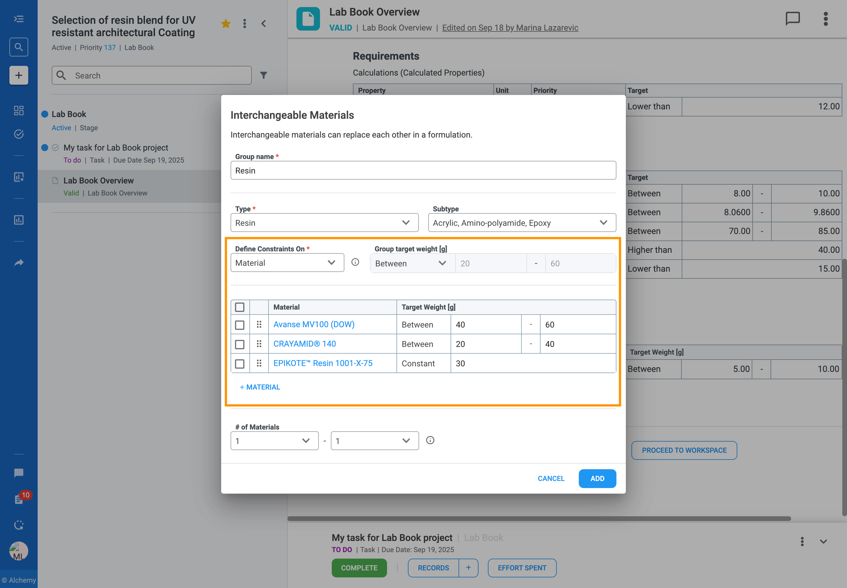
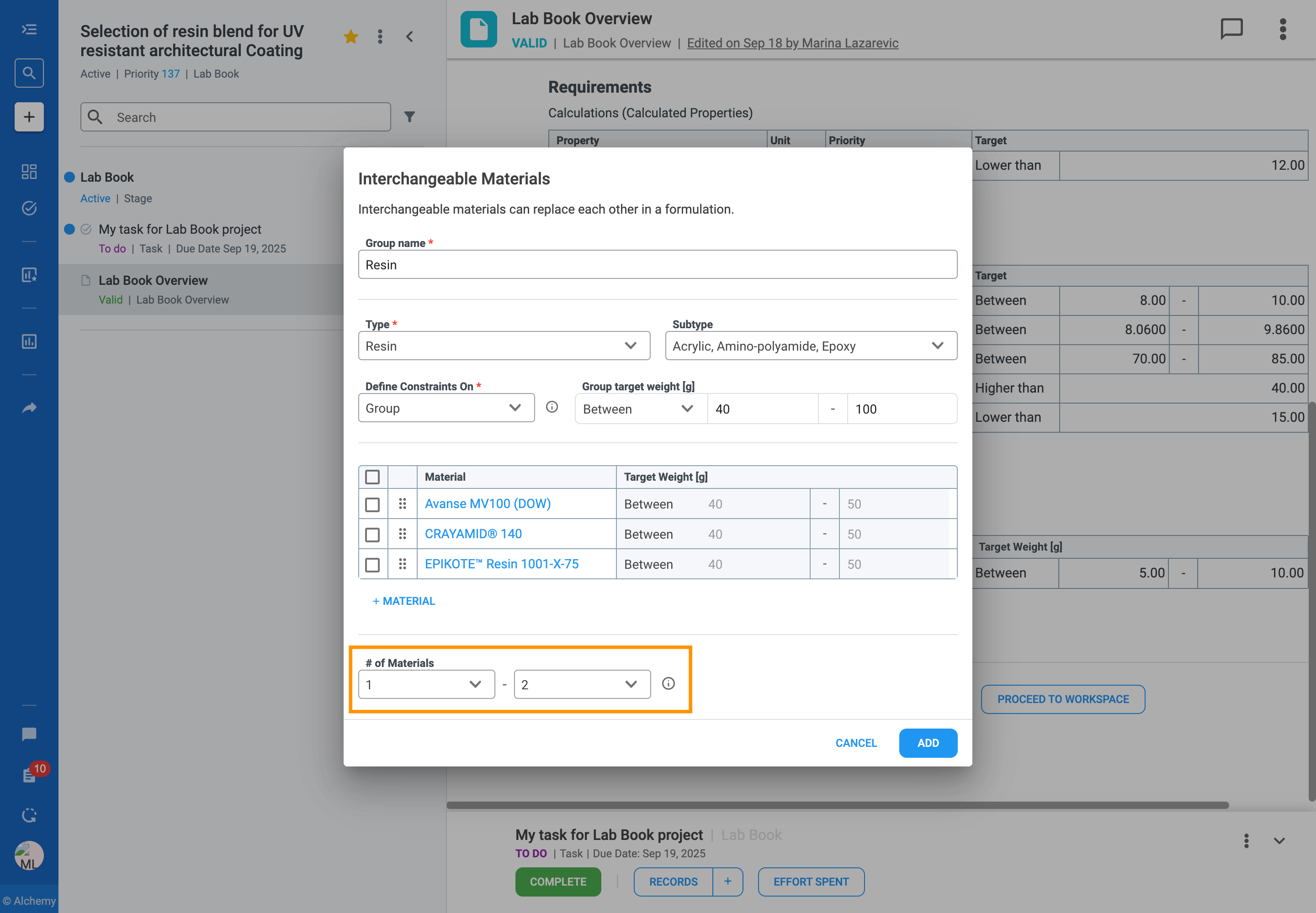
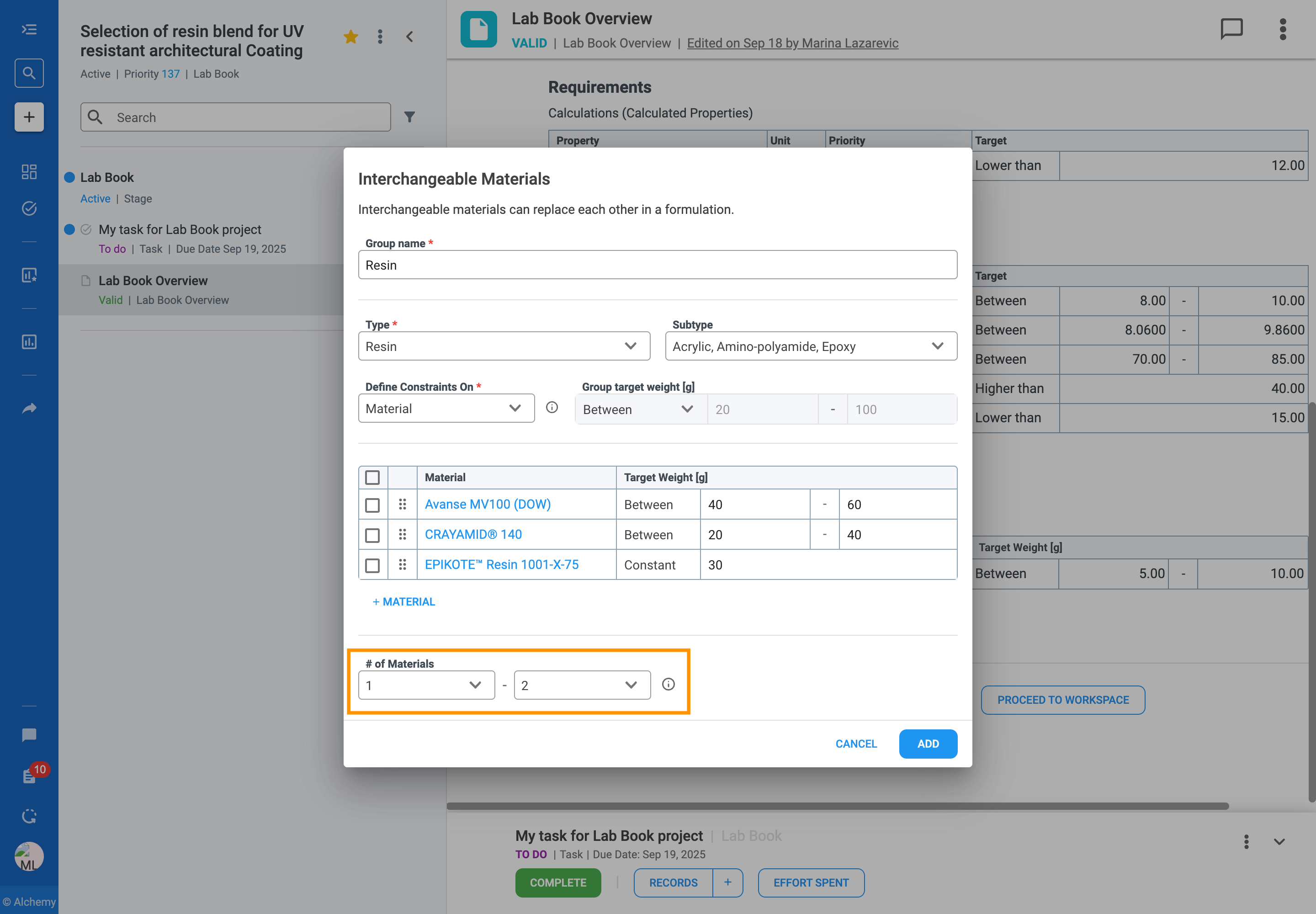

The rules you define for interchangeable materials directly guide how the platform generates a Design of Experiments (DOE), scores trials in Scan & Score, and creates AI recommendations.
When an interchangeable material group is added, DESIGN EXPERIMENTS and ALCHEMY AI are adjusted to incorporate the formulating strategy. The formulating strategy determines how the interchangeable materials are varied and combined during experiment design and AI training, ensuring that the generated trials and model outputs respect the defined group relationships.
When you use Scan & Score, the system will only show trials that follow the rules you defined for your interchangeable materials. This includes:
The values in the Scan & Score table are color-coded to indicate if they meet the constraints you set. Green means the value is within the defined range while red means it violates the rules.
The following supplemental material is used to support the above documentation.
This appendix provides a deeper reference for the Detailed Analysis tab of the AI-Powered Statistical Analysis report (Section 2.5.2). It explains, for each section of the report, what the metric or test means, why it matters for Machine Learning, and what action to take if the result is unfavorable.
Reports the size of the dataset: number of input variables (independent variables) and number of target variables (dependent variables). Use this as a quick sanity check that the dataset captured by Scan & Score matches what you defined on the Lab Book Overview record.
Confirms which variables Alchemy treats as inputs (predictors) versus targets (outputs), and whether each variable is categorical or continuous. This classification drives the choice of regression vs. classification algorithms in training.
Reports how many data points per feature are available in the dataset for each target variable. Low coverage relative to the number of features increases the risk of overfitting; the model has too few examples to learn from.
How many times each feature is present in the dataset with a value different than 0. Feature representation that is very low — i.e., the variable is rarely observed or is mostly missing — makes it difficult for ML models to learn a reliable relationship: the model either ignores the feature (treating it as low-variance and uninformative) or overfits based on the few rare samples. This significantly reduces robustness and usually requires manual intervention (deleting the underrepresented materials from the Constraints table on the Lab Book Overview record, which also excludes the few trials that contain them from the dataset).
Reports the coefficient of variation (CV) for each target variable. A high CV indicates a large amount of intrinsic variability relative to the mean: the data is either noisy or has a vast, poorly modeled range. The signal (the actual trend) is obscured by the unexplained scatter, which makes it significantly harder for an ML model to achieve high predictive accuracy.
To resolve this, let ALCHEMY AI / TRAIN AI evaluate robust non-linear algorithms such as Gradient Boosting and Random Forests, which cope well with heterogeneous variance, and select the one that performs best on your dataset.
Note that with small sample sizes, the standard deviation is highly unstable and likely to change significantly as more data are added.
Identifies variables with constant or very small variance. Such variables provide little to no discriminative information to the model: they cannot help distinguish between different outcomes or samples. Including them adds noise and computational overhead without contributing to predictive power. Constant variables are automatically excluded from model training, since they cannot improve predictions. For low-variance variables that are not strictly constant, consider whether the lack of variation is intentional or whether more diverse samples should be collected before continuing.
Multicollinearity is the statistical phenomenon where two or more independent predictor variables are highly correlated with one another. Multicollinear pairs introduce redundancy and instability, making it difficult to accurately interpret individual feature importance or coefficient values. To resolve this, use ALCHEMY AI / TRAIN AI to evaluate a wider set of algorithms — including regularization techniques such as Ridge and Lasso regression that are designed to handle multicollinearity — and let the system select the algorithm that performs best on your dataset.
Tests whether input variables and target variables are normally distributed. Failing the normality test for target variables primarily concerns Linear Regression (OLS): non-normal target variables usually lead to non-normal residuals, which violates a core OLS assumption and renders p-values and significance tests unreliable. Non-normal input features do not violate core OLS assumptions, but severe skewness still hinders finding clean linear relationships and may require feature transformation.
When target variables are clearly non-normal, use ALCHEMY AI / TRAIN AI to evaluate a diverse set of algorithms — including non-linear models that do not require the normality assumption — and let the system select the one that performs best on your dataset.
Tests for outliers using the modified z-score and informs the user which input or target values are flagged. Outliers in either inputs or targets typically reduce model performance and reliability: extreme values can disproportionately influence the fitted regression line. Input outliers can shift the slope of the line; target outliers increase the model's overall residual error (e.g., MSE).
Recommended action. For input outliers, design additional trials to fill the gap in the design space between the cluster of typical input values and the flagged extreme value. For target outliers, retest flagged trials as replicates to confirm whether the extreme value is reproducible; repeated tests help distinguish a real outlier from a one-time measurement error. If the outlier proves genuine, use ALCHEMY AI / TRAIN AI to evaluate robust algorithms such as Random Forests and Gradient Boosting, which are less sensitive to extreme values, and let the system select the one that performs best on your dataset.
G-efficiency is a score that tells you how well spread out your data points are across the design space. G-optimality seeks to protect against the worst-case prediction variance — i.e., the model’s ability to predict well across the whole design space.
A higher G-efficiency value is better: it indicates a more optimal design where the variance of the predicted response is minimized across the design space, leading to more reliable and stable coefficient estimates. The direct impact on modeling is that the resulting regression model has greater statistical power to detect true factor effects and produce more precise predictions across all factor settings.
Assess how uniformly spread out the experiment points are within the multidimensional design space. For ML, maximizing this distance ensures better coverage of the input domain, which increases the model’s ability to generalize and make accurate predictions across the entire range of possible recipes or conditions.
Quantify the non-uniformity or irregularity in the distribution of data points within the multidimensional design space. For ML, minimizing discrepancy means maximizing the space-filling quality of the data — crucial for building accurate predictive models that perform reliably across the entire range of possible input combinations. Low discrepancy (high uniformity) ensures that no large empty gaps exist in the experimental region, making predictions more robust and reducing uncertainty.
Cluster Analysis groups your historical trials by similarity, identifying distinct "families" of formulations within the dataset. For each cluster, the report lists the input variables that are statistically higher or lower than the overall dataset average — these values describe what makes the cluster distinct, not whether it is "better" or "worse" than the others.
Neither many nor few clusters is automatically preferable. What matters is whether the clusters align with formulation strategies you recognize: a few well-defined clusters that map to families you've explored confirms the dataset has structure the model can learn from, while many small clusters or one large indistinct cluster usually indicates a dataset that lacks meaningful sub-structure.
The analysis also serves as a coverage check: if the design region you care about is sparsely represented in the surfaced clusters, the model will potentially struggle to predict there — consider extending the dataset with ALCHEMY AI / TRAIN AI (IMPROVE MODEL PERFORMANCE) to fill the gap.
Reports the linear relationship between each input variable and the target. Correlation analysis is important for ML because it quickly measures the strength and direction of simple associations between features and the target. From this you learn whether each input feature has high, moderate, or low predictive potential (strong, moderate, or low correlation with the target). The SHAP analysis (Section 6.1.6.2) then refines this picture by capturing non-linear effects and feature interactions that correlation alone can't see.
SHAP measures how much each feature affects the prediction of a model. The SHAP value is a quantitative score derived from comparing predictions made when a feature’s information is present (its actual value) versus when its information is absent (replaced by a baseline or average). This comparison lets SHAP accurately attribute the final prediction score to each input.
Identifies the best-performing model, along with the coefficients, p-value, and significance for each predictor.
Validates the model’s assumptions through diagnostic plots and tests. If these tests fail, the resulting p-values and confidence intervals are unreliable, which prevents the user from trusting the model’s assessment of factor significance and the precision of its predictions. Consequently, the user cannot be confident in identifying the truly influential factors or in optimizing the process based on the model’s conclusions.
Flags individual data points with High Leverage, High Cook’s Distance, and High DFITS — i.e., observations that exert disproportionate influence on the regression model. High Leverage points have extreme input feature values that pull the fitted line toward themselves. High Cook’s Distance and High DFITS identify data points that, if removed, would significantly change the model’s coefficient estimates and/or predicted values. These points require careful review — they are often outliers or mismeasurements that distort the model.
Mixture Design, a subtype of Screening and Optimal Designs, is intended for experiments where the user is interested in the influence of varied dependent variables (weight or volume percentage of each material) on target properties.
Mixture design is automatically proposed when the Formulating input is set to Target Weight [%] — i.e., when each material's quantity is expressed as a percentage of the total batch rather than as an absolute weight or volume.
Required constraints for each material are:
Rules which need to be respected for properly setting the constraints:
Mixture Process Design, a subtype of Screening and Optimal Designs, is intended for experiments where the user is interested in the influence of varied dependent variables, materials (weight or volume percentage of each material) and processing steps, on target properties.
Mixture Process design is automatically proposed when the Formulating input is set to Target Weight [%] and the design includes one or more processing steps in addition to the materials.
Required constraints for each material are:
Required constraints for each condition from processing step are:
Rules which need to be respected for properly setting the constraints:
Factorial Design, a subtype of Screening Design, is intended for experiments where the user is interested in the influence of varied independent variables, materials (values for weight and/or volume) and/or processing steps on target properties.
Factorial design is automatically proposed when the user inputs weight and/or volume for materials and/or processing steps.
Required constraints for each material are:
Required constraints for each condition from processing step are:
Constraints are valid without any rules.
Response Surface Design, a subtype of Optimal Design, is intended for experiments where the user is interested in the influence of varied independent variables, materials (values for weight and/or volume) and/or processing steps, on target properties.
Response surface design is automatically proposed when the user inputs weight and/or volume for materials.
Required constraints for each material are:
Required constraints for each condition from processing step are:
Constraints are valid without any rules.
This appendix is a non-technical reference for the Model Explainer tabs that are available for regression target properties (continuous numerical outputs such as Viscosity, Hardness, or Drying time). It describes, for each tab, the question the tab answers, what the user is looking at, how to read “good” vs. “bad,” and why the view matters.
Acronyms used in this appendix
RMSE (Root Mean Squared Error). Measured in the same units as the property being predicted; represents the typical distance between the prediction and the true value. Smaller numbers mean predictions are closer to the target.
MAE (Mean Absolute Error). Also in the same units as the property; shows the average distance between predictions and actual values. Lower values mean more consistently accurate predictions.
R² (Coefficient of Determination). Ranges from 0 to 1 and measures how well the predicted values follow the actual data. Values closer to 1 mean the points fall closer to the ideal diagonal line (predicted = actual).
SHAP (SHapley Additive exPlanations). Shown on a positive-to-negative scale where distance from zero indicates how strongly a feature pushes the prediction up or down, and larger magnitudes mean greater impact on reaching or missing the target.
Question it answers: Which ingredients or process parameters matter the most?
What you’re looking at: A ranked list of features showing which ones have the biggest overall impact on the predicted property. Longer bars indicate bigger influence; shorter bars, smaller influence.
What “good” looks like: A clear set of top drivers that align with your domain intuition; the most important features are also measurable and controllable in production.
Why this matters: Tells you which variables deserve the tightest control in manufacturing, helps R&D focus effort on the inputs that actually move performance, and lets you deprioritize or simplify low-importance features. Rule of thumb: if changing a feature would meaningfully change the prediction, it should appear near the top.
Question it answers: How good is this model overall?
What you’re looking at: Error metrics (RMSE, MAE), the R² score, and a Predicted vs. Actual plot. RMSE and MAE describe how far off predictions are on average — lower is better. R² describes how much of the real-world variation the model explains — higher is better. The Predicted vs. Actual plot shows visually how close predictions are to reality.
What “good” looks like: Low error values, R² close to 1, and points clustered along the diagonal of the Predicted vs. Actual plot.
Why this matters: These tell you whether the model is reliable enough to guide real decisions, not just to generate interesting charts.
Question it answers: Is the model making consistent, unbiased errors?
What you’re looking at: Residuals vs. Predicted and Residuals vs. Feature plots. A residual is the actual value minus the predicted value; you want errors to look random rather than patterned.
What “good” looks like: Points scattered randomly around zero, with no curves, funnels, or trends.
Why this matters: Patterns here mean the model is systematically wrong in certain regions of the design space — risky for optimization or scale-up.
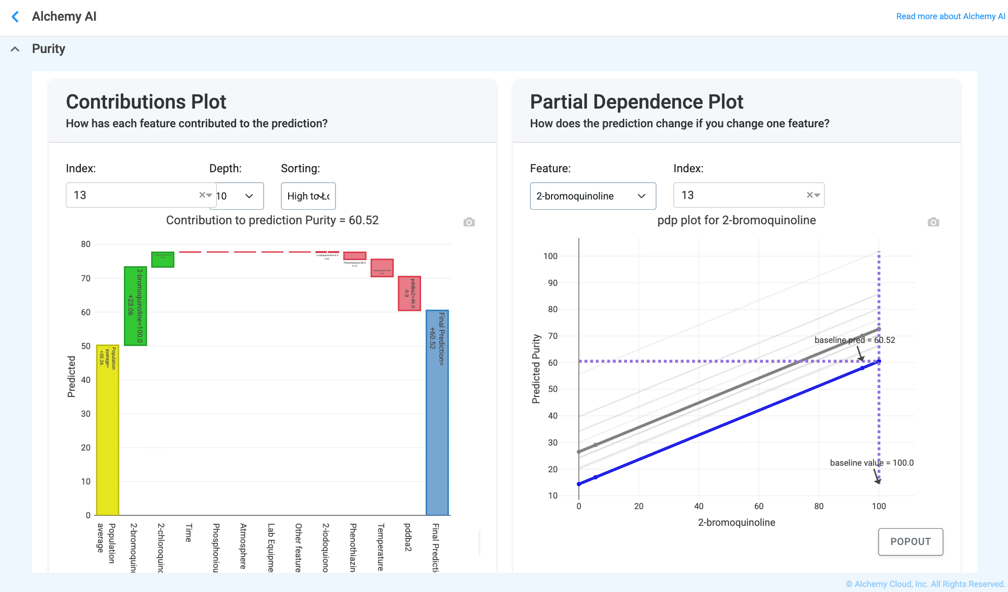
Question it answers: Why did this specific formulation get this prediction?
What you’re looking at: The predicted versus actual value for one chosen sample, paired with a contribution (SHAP) breakdown that shows how each feature pushed the prediction up or down. The model starts from an average baseline; each feature either increases or decreases the prediction; the sum of those pushes equals the final predicted value.
What “good” looks like: The largest contributions come from known, meaningful features; the explanation matches scientific intuition.
Why this matters: This is where trust is built. Users can see exactly which ingredients or conditions caused a high or low prediction.
Question it answers: What happens if I change this ingredient or process setting?
What you’re looking at: Interactive controls to change inputs, with predictions and explanations updating in real time. This is a digital experiment: adjust a concentration, temperature, or parameter, and instantly see how the predicted property changes — and why.
What “good” looks like: Smooth, predictable responses to small input changes, and a clear sense of which inputs the property is most sensitive to.
Why this matters: Enables fast exploration without physical experiments; supports target-seeking (“what do I change to hit this spec?”); and helps avoid risky or extreme combinations before committing to lab work.
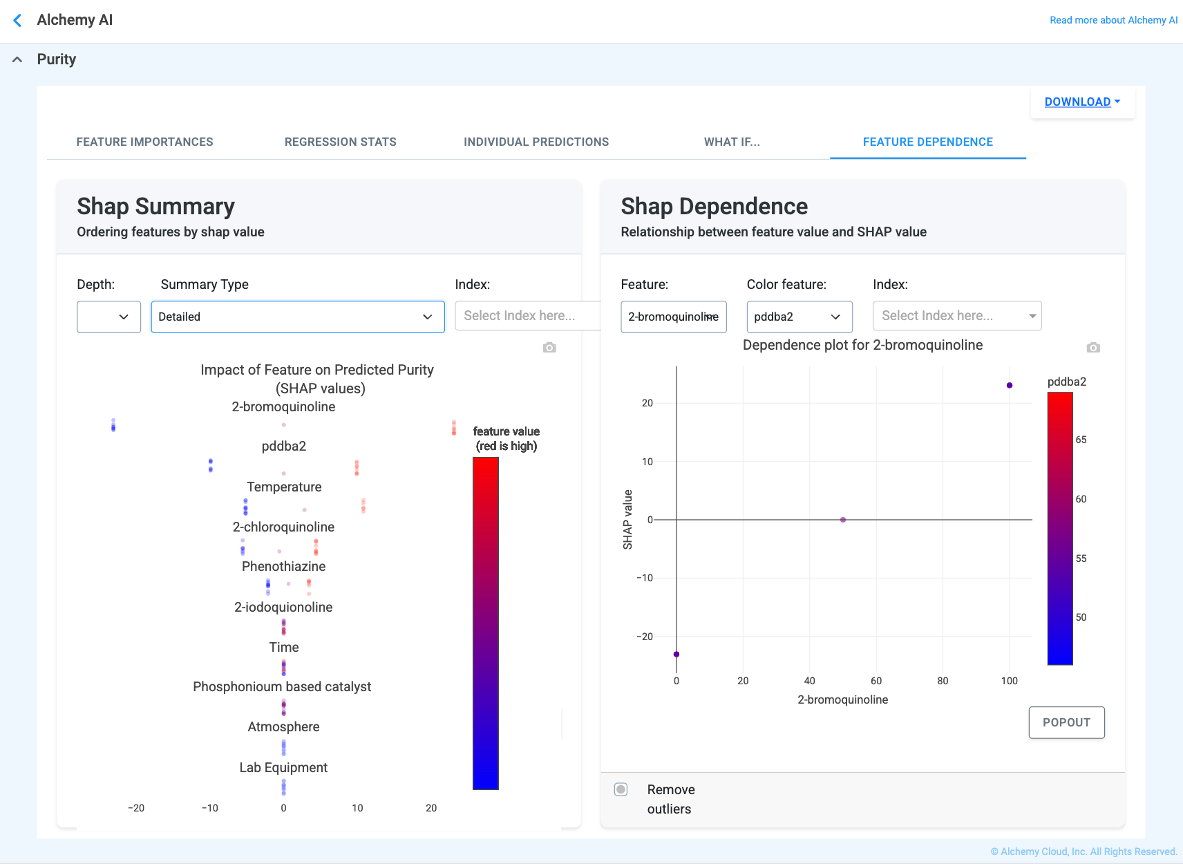
Question it answers: How does changing one input generally affect the output?
What you’re looking at: Plots showing how a feature’s value relates to its impact on predictions. The X-axis is the feature value, the Y-axis is how much that feature pushes the prediction up or down, and color encodes another feature that may interact with it.
What “good” looks like: Clear trends — increase, decrease, or plateau — and interactions that make physical or chemical sense.
Why this matters: Helps identify non-linear effects, sweet spots, and interactions where two ingredients together behave differently than alone.
Feature Interactions (Synergy vs. Antagonism):
Synergy: two features together have a bigger positive effect than expected. Antagonism: one feature reduces the effect of another. No interaction: the two features behave independently.
What you're looking at: When points stratify into distinct color bands (different colors taking different SHAP-value paths along the X-axis), you have an interaction — the effect of the X-axis feature depends on the value of the color feature. When the colors are randomly mixed throughout the cloud, the two features behave independently and there is no interaction.
Why this matters: Critical for formulation science, where combinations matter more than single ingredients.
This appendix is a non-technical reference for the Model Explainer tabs that are available for classification target properties (predefined categorical outputs such as Pass/Fail, or any other set of named categories). It mirrors the structure of Appendix F but adapts the explanations to classification metrics.
Acronyms and key terms used in this appendix
ROC AUC (Receiver Operating Characteristic Area Under the Curve). A performance measurement for classification problems at various threshold settings. It tells how well the model is able to distinguish between classes.
PR AUC (Precision–Recall Area Under the Curve). Summarizes the trade-off between precision and recall using different probability thresholds.
Log Loss (Logarithmic Loss). Penalizes false classifications by taking into account the probability of the prediction. Lower values indicate better performance.
SHAP (SHapley Additive exPlanations). Distance from zero indicates how strongly a feature pushes the prediction toward one class or another; larger magnitudes mean greater impact.
Class (Category). The specific group or label the model is trying to predict (for example, “Pass” vs. “Fail”).
Probability. A number between 0 and 1 (or 0% to 100%) that represents the model’s confidence. A 0.85 probability means the model is 85% certain a sample belongs to a specific class.
As in the regression case (Appendix F), Feature Importance ranks the inputs by their overall impact on the predicted class. Same interpretation, same rule of thumb: longer bars mean a feature has stronger influence on the predicted probability of a class.
Question it answers: How reliable is this model overall?
What you’re looking at: Accuracy, Precision, Recall, F1 Score, ROC AUC Score, PR AUC Score, and Log Loss.
Accuracy. Percentage of total predictions that were correct — higher is better.
Precision. When the model predicts a category, how often is it actually correct — higher is better.
Recall. Out of all the actual instances of a category, how many did the model correctly identify — higher is better.
F1 Score. A balanced metric that combines precision and recall — closer to 1 is better.
ROC AUC Score. 0–1 score that measures the model’s ability to separate classes — closer to 1 is better.
PR AUC Score. Area under the Precision–Recall curve; higher values indicate better performance, particularly on imbalanced datasets.
Log Loss. Measures the “uncertainty” of predictions — lower values mean the model is more confident and correct.
What “good” looks like: High Accuracy, Precision, Recall, F1, ROC AUC, and PR AUC; low Log Loss; and high diagonal percentages on the Confusion Matrix (Observed class = Predicted class).
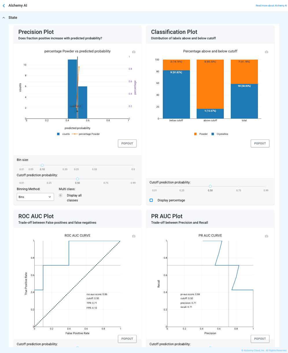
The Classification Stats tab includes several plots that go beyond aggregate metrics. Each is described below in plain English.
Confusion Matrix
What it is. A grid of observed vs. predicted classes — a scorecard showing where the model was right and where it got confused.
What “good” looks like. High numbers in the diagonal boxes (top-left to bottom-right) and near-zero numbers everywhere else.
Why this matters. It tells you exactly what kind of mistakes the model makes — does it miss real cases (false negatives) or sound false alarms (false positives)?
Precision and Classification plots
What they are. Two paired views of how “separation” works. The Classification plot shows the distribution of labels relative to a probability cutoff; the Precision plot tracks how the actual positive rate moves with the model’s predicted probability.
What “good” looks like. In the Classification plot, two distinct “humps” (one per category) with very little overlap. In the Precision plot, a steady upward line.
Why this matters. If the humps overlap, the model is “unsure” in that region. If the precision line goes up, you can trust a “90% confidence” score to be right roughly 90% of the time.
ROC AUC and PR AUC plots
What they are. “Stress test” curves that show the trade-off between being thorough and being accurate.
What “good” looks like. The ROC curve should bow deeply toward the top-left; the PR curve should stay high and trend toward the top-right.
Why this matters. These show the overall “strength” of the model. A high AUC means the model is excellent at ranking the best formulations at the top of the list.
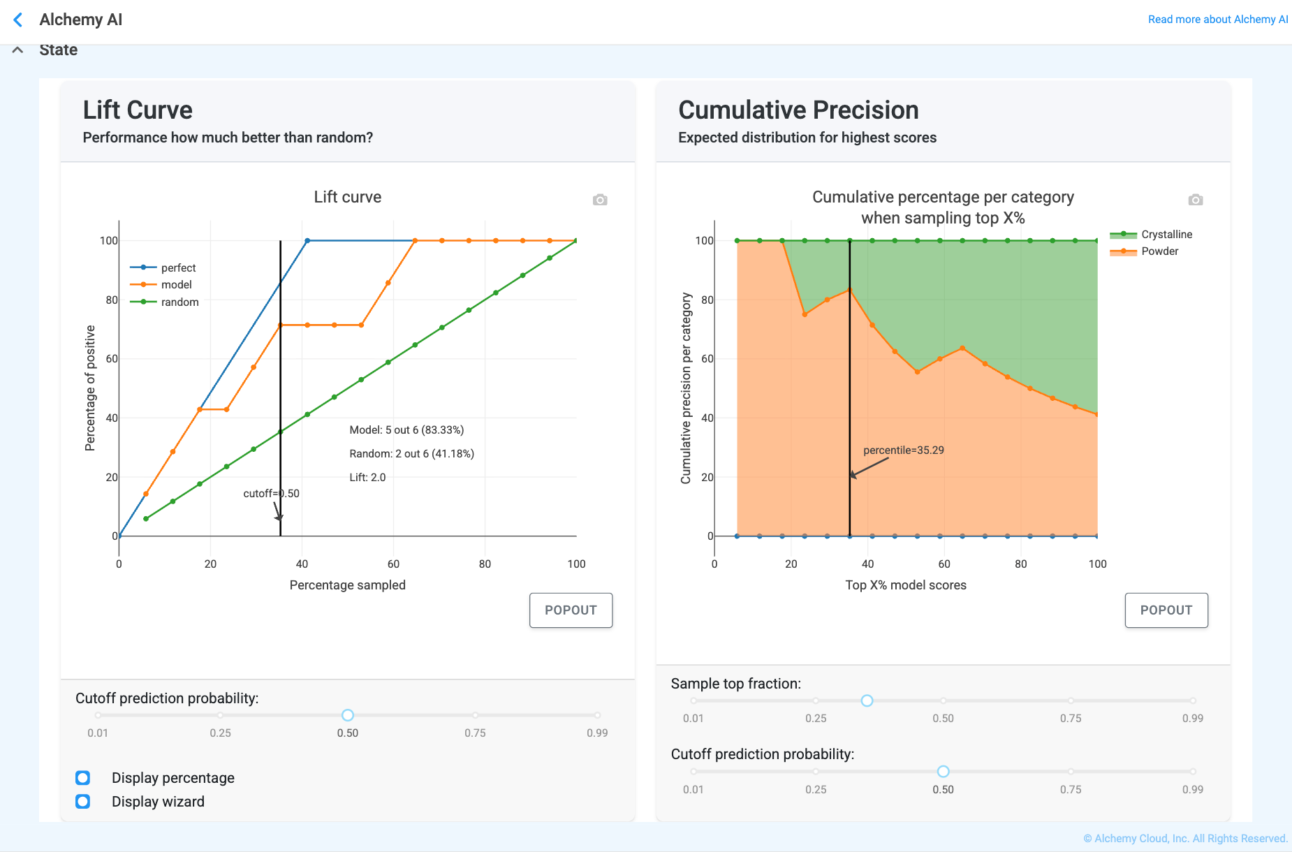
Lift and Cumulative Precision curves
What they are. “Value add” curves that show how much better the model performs than random guessing.
What “good” looks like. Curves that start very high on the left and stay well above the diagonal baseline.
Why this matters. They tell you, for example, “If I only have the budget to test the top 10% of samples recommended by the model, how many successes will I find?” — a Lift of 3.0 means three times more successes than picking at random.
Question it answers: Why did this specific formulation get this prediction?
What you’re looking at: A Contributions plot — a SHAP breakdown showing how each feature pushed the specific prediction up (toward one class) or down (toward another) — and a Partial Dependence Plot, which shows how the predicted probability of a class changes if you vary one specific feature while holding the others constant. The model starts from an average baseline; each feature increases or decreases the probability of the designated positive class; the sum of those pushes equals the final predicted probability.
What “good” looks like: The largest contributions come from known, meaningful features, and the explanation matches scientific intuition.
Why this matters: This is where trust is built. Users can see precisely which factors led to a high or low probability of achieving the positive class.
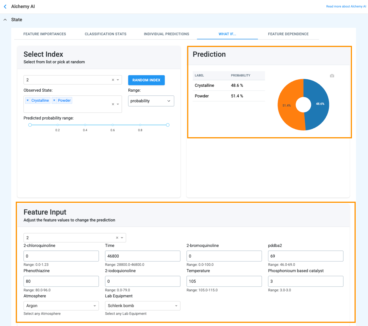
Question it answers: What happens to the final category if I change a temperature, time, or concentration?
What you’re looking at: Interactive controls that update probabilities in real time. Adjust a concentration, temperature, or parameter; instantly see how the probability of a specific outcome shifts; and read the explanation of why it shifted.
What “good” looks like: Smooth, predictable probability shifts where small changes in inputs lead to logical changes in the probability of a category, plus a clear sense of which “tipping points” cause the model to switch its prediction from one category to another.
Why this matters: Enables fast exploration without physical experiments; supports target-seeking (“what do I change to hit this category?”); and helps avoid risky or extreme combinations before committing to lab work.
Same idea as the regression view (Appendix F), but the Y-axis here represents how much the feature pushes the predicted probability for the positive class up or down, rather than a numerical target value.
Same definitions as in Appendix F, Synergy = two features together have a bigger effect on the predicted class than expected; antagonism = one feature reduces the effect of another; no interaction = they behave independently. Reading the Feature Dependence colored scatter: distinct color bands indicate an interaction (the effect of the X-axis feature depends on the color feature); randomly mixed colors indicate no interaction.