Enhanced Scatter Plot
Make highly customized scatter plots in fewer clicks.
Chemists frequently use scatter plots to graphically represent their lab data.
In previous versions of Alchemy, making scatter plots was possible. With this release, the feature is easier to set up and granularly format.
How to make a Scatter Plot
To make a Scatter Plot, first make a View that includes the data you would like to chart. In the example below you can see a list of Formulations and their different parameters (Created On, VOC Content [%], Solids Content [%], Pigment Content, PVC).

Click on the plus icon next to the Data tab and select Scatter (Figure 1b).
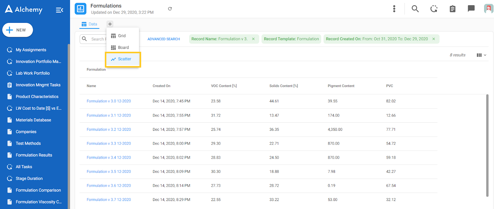
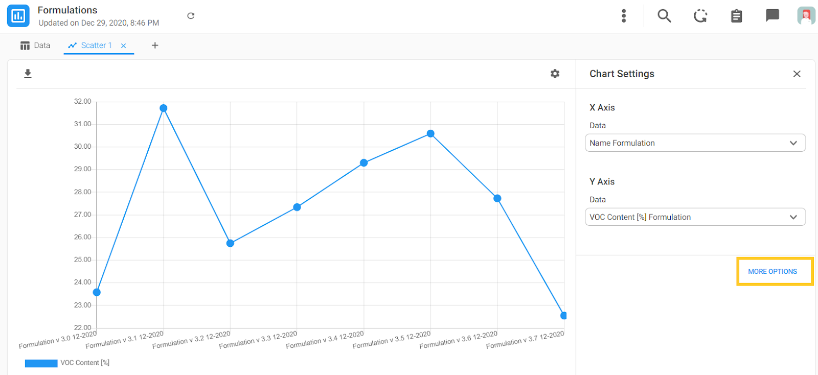
On the Scatter Plot start screen (Figure 1c) you will see short directions that explain what you need to click to start. Highlighted on the right side of the screenshot are the Chart Settings where you will select the data you want to plot (columns that were visible in Figure 1a).

In this example we selected Formulation Names for the X axis and VOC Content [%] for the Y axis. As you can see in Figure 1d), all the columns that were available in the Data tab are available in the drop-down from which you can select your desired values.

Your Scatter Plot is now generated! The Chart Settings box can be hidden by pressing the 'x' icon in the Chart Settings title bar and re-opened by clicking on the cogwheel icon.

Next we will dive deeper into the formatting options.
More Options For Axis
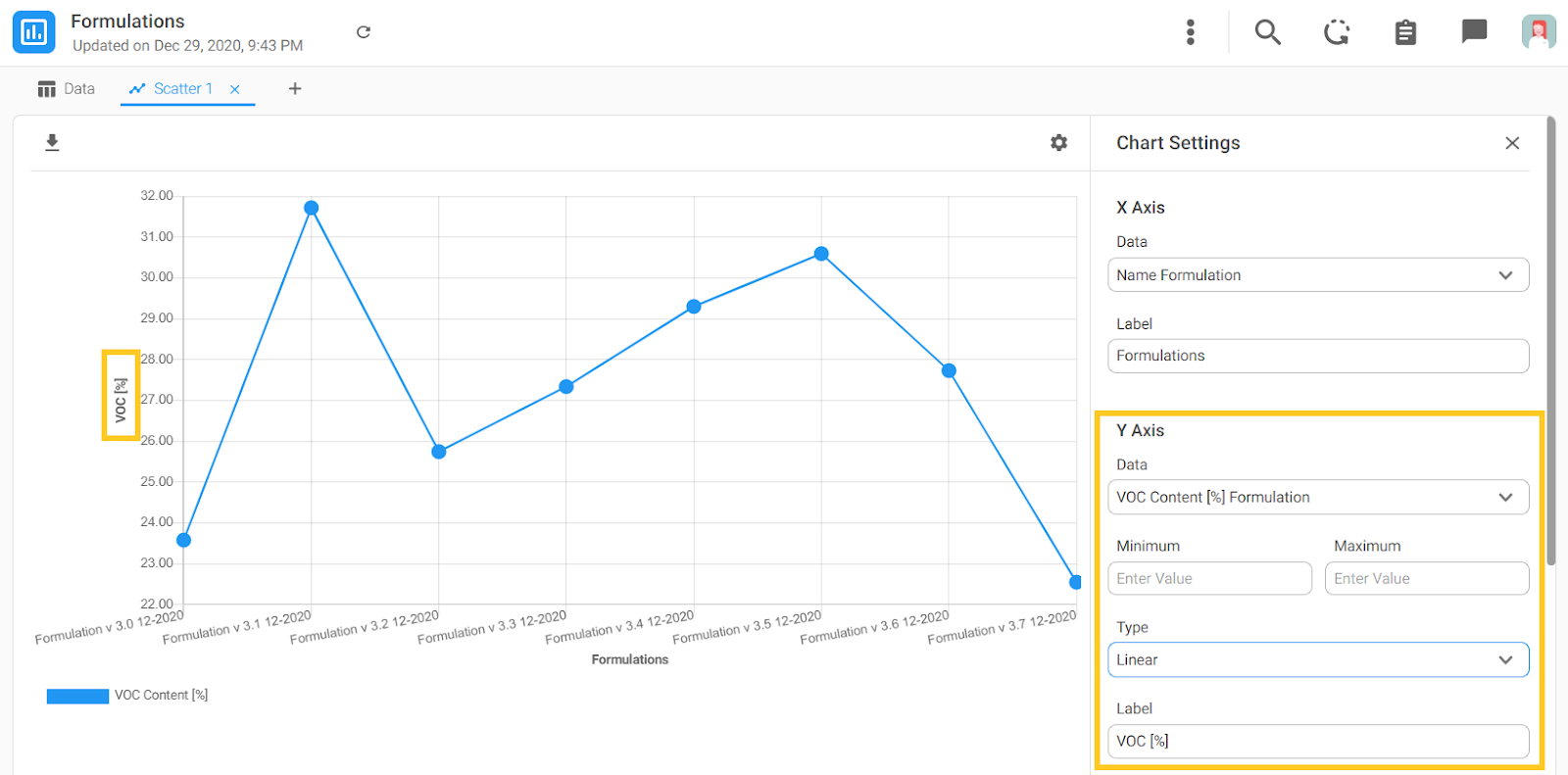
If you'd like to format elements of the axis, you can click on the MORE OPTIONS button in the bottom right corner of the Chart Settings box.
In this example, we labeled the X axis 'Formulations'.
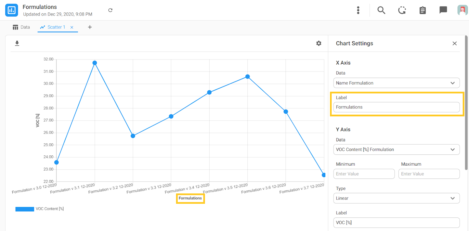
For the Y axis there are a few options:
- You can define the minimum and maximum of the displayed values
- Select the Type of axis (Linear or Logarithmic)
- Label the Y axis (in our example it's 'VOC [%]')
More Options for Formatting
In the Chart Settings box if you scroll below the Y axis options, you will see formatting options for the series. These formatting options, which you can see in detail in Figure 3 below, include:
- Point (or marker) formatting
- Shape - in the example below, we selected rectangular
- Color - purple
- Size - large
- Line formatting
- Type of the line - in the example below, we selected Dashed
- Color - Light Blue
- Weight - Bold
- Fitting Method - Linear Interpolation
Finally, you can close More Options by clicking on the LESS OPTIONS button in the bottom right hand corner of the Chart Settings box.
