Purpose
This guide outlines how to create a heatmap in a View. A heatmap is a two-dimensional representation of data, where rows and columns are denoting different sets of data. Heatmaps are used to correlate a series of data in the View.
Instructions
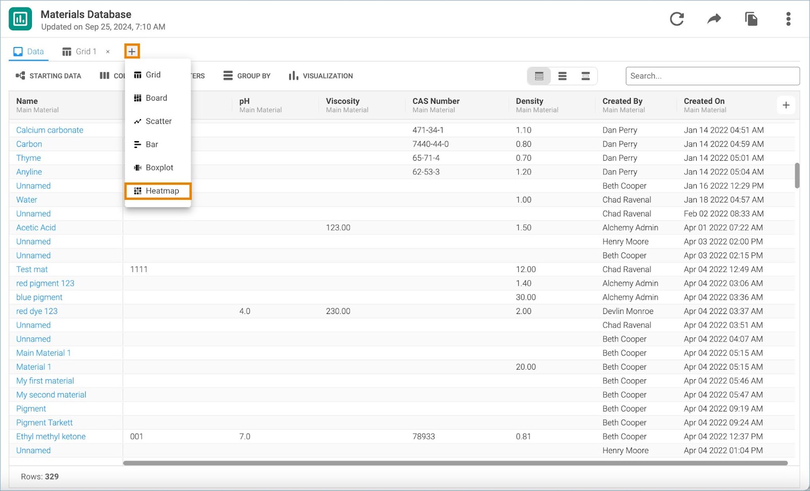
1. Click the + icon next to the Data tab to display a dropdown with various visualization options and select Heatmap.
2. The chart settings window opens in a separate tab. Double click on the tab name to rename the chart.
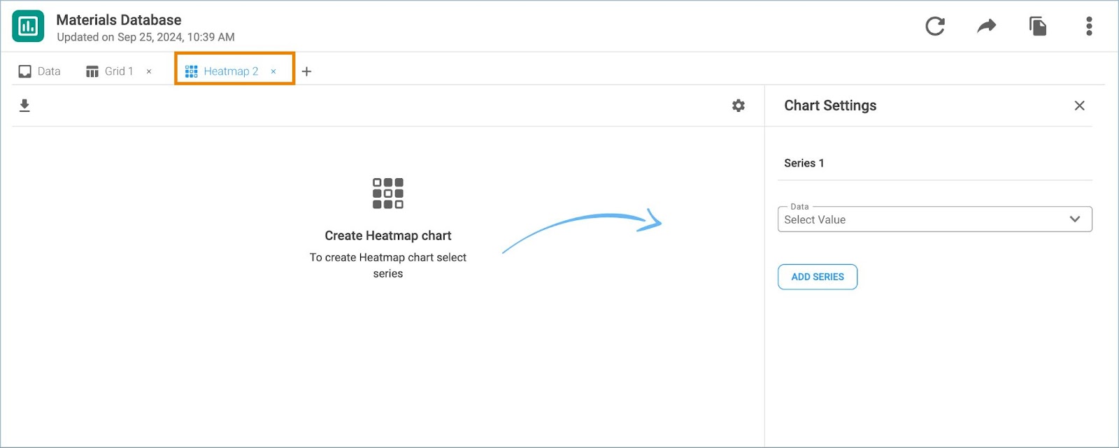
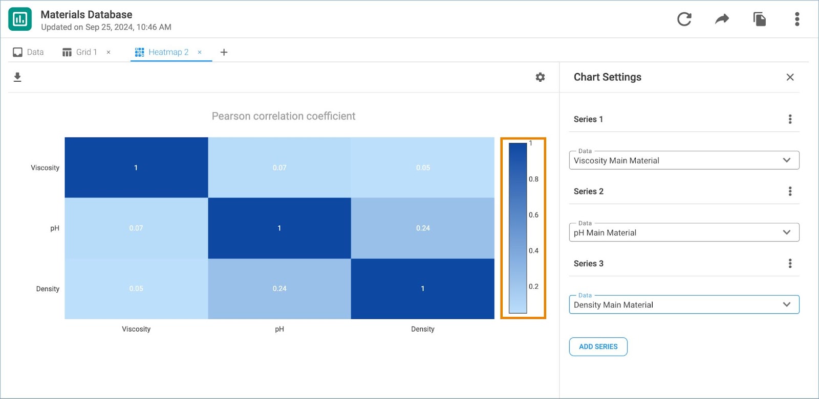
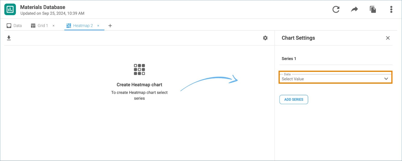
3. Choose the data which will be displayed in the heatmap for Series 1.
4. Click Add Series to add data for correlation. Click the series menu icon to remove the undesired series of data from the Heatmap.
Note: If a record reference field is added, select the Transform Field variable and the Grouped By value.
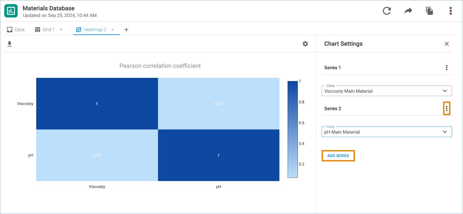
5. The legend is placed on the right side of the Heatmap. Correlation coefficients equal to 1 indicate direct positive correlation, while -1 is indicating strong negative correlation. If there is no correlation between the variables the correlation coefficient will be 0.
Note: Empty fields in the heatmap indicate missing data.